Let me seduce you into trusting me by being so bland, so innocuous that I will easily lull you into a state of blessed relief.
One might think that the function of a logo and associated corporate branding is to stand out from the crowd, to do a little dance and shimmy in order to catch the eye and make a lasting impression. A good logo is worth its weight in golden arches, able to connect instantly with its target prey… err, audience, and engender all those positive feelings of association, desire and, ultimately, consumption.
But not in this case. It would be a challenge to come up with a logo any more insipid or meaningless – and if you did, it would probably, perversely, be quite a bit more interesting. This has just the right degree of instant forgettability, the design equivalent of a backbencher’s speech (or a blog), existing for its own sake but barely noticed by anybody. But why?
God knows there are enough boring logos out there without anybody deliberately trying to add to the pile, but this one is so anonymous as to suggest it is part of a calculated strategy. And what of the brand name? I defy anybody to tell me, from the name alone, what this company is selling. It really is a mark of genius to come up with a name that evokes almost no connotations at all, neither good nor bad, positive or negative. It exists in its own perfectly poised bubble of meaninglessness.
I could say something about the colours too – a dominant blue and a highlight colour which is another… I dunno, maybe another kind of blue? We all know about blue though. Calming, safe, secure, reliable – so perhaps this gives you a clue as to where this is all going.
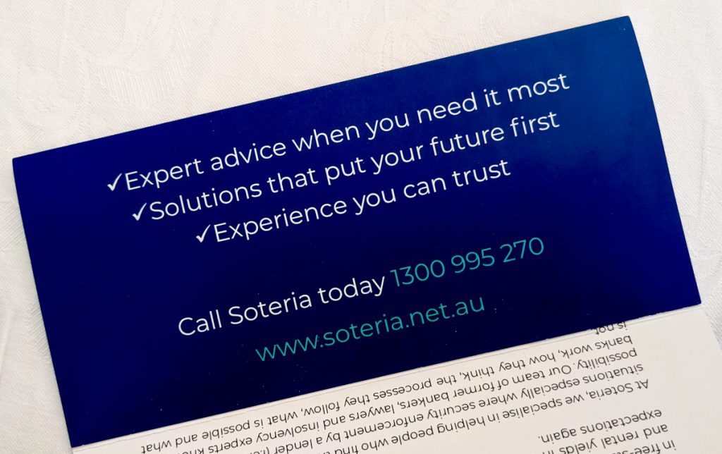
Let’s open it up anyway (it’s an A4 roll fold to DL size) and see the reveal.

You see, that in itself is a kind of brilliance. Expert advice, solutions, experience… and still I have no idea what they are selling. It’s almost as if they don’t want me to know what they do. I might even have to call them up to find out. It’s got to be an arms dealer eh? Or a company that wants to take away my nuclear waste.
 Opening up the whole piece gives the game away immediately with a cartoon image of a man kicking a wrecking ball of DEBT while his family safely make their way home to a little suburban house. It’s about money – or rather that largely taboo topic of personal financing: debt. Crushing debt. Debt that is about smash our lives and destroy everything we’ve worked so hard to accumulate. Debt that threatens to annihilate who we are. An existential level of debt that consumes everything in its path.
Now it all makes sense; the low-key approach, the deliberate avoidance of any razzle-dazzle or blowing of trumpets. The key word here is stress; this is already a highly-charged situation (if you’re the person to whom this leaflet is speaking) so the goal is not to inject more emotion into the proposition, to hype it up, but rather to drain it all away. Make it seem totally normal, boring, manageable. Unremarkable.
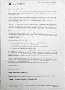
The rest of the flyer is just text in the form of a letter which, again, is quite noteworthy for what it does. Nobody reads this much, do they? Not in an advertising flyer anyway. Even with the inclusion of four bullet points to break it up a bit, that’s a lot of words to consume.
The whole thing is crafted to be quietly soothing, professional and authoritative. Peace of mind is mentioned a couple of times. It speaks of helping people ‘who find themselves in mortgage stress’ as if, lo and behold, they suddenly woke up one morning and found themselves surrounded by a thicket of missed payments. Shit, where did all this fucking debt come from?
One sentence in particular is worth quoting, just for the way it breaks all the rules of snappy, incisive copy writing:
We understand how stressful it can be to be under financial pressure so we’ve developed a completely different business model that puts you at the heart of the process to develop a solution tailored to your unique situation that really works to remove the stress.
Wow. I don’t know what it means exactly but at the end of it I’m too exhausted to offer any resistance. Whatever it is they’re handing out, I want some of it.
I understand, too, how such word assemblages work, if only because I’m equally guilty of writing swathes of similarly meaningless buzzword-heavy text blobs which sound as if they’re groping towards an insight of staggering significance without, ultimately, really saying anything at all.
Just a side note – it’s interesting how often hyperlinks are preserved in printed document these days, underlined and in a different font colour, as happens with the company website address here. It’s probably because the document was originally created as a pdf which kept the link and its styling. We’re so blinded to it now nobody notices to take it out even when the functionality no longer exists.
Overall, I now have a vague idea about what Soteria does although the main take-away I get from this leaflet is that they are expertly skilled in tackling something that people really don’t want to have to deal with and then simply boring it into submission.
Yeah, I can relate to that.


