Archives: Brochures

The NRMA brochure

The NRMA Review

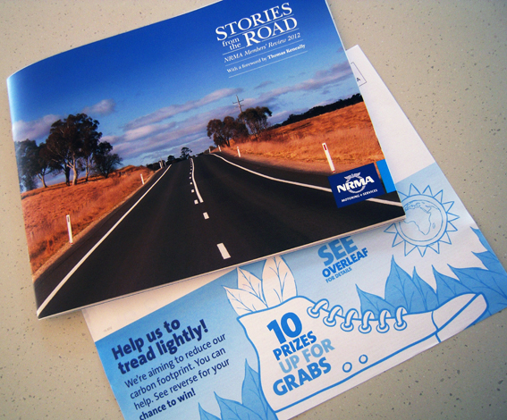
An interesting publication arrived in the post from the NRMA. It’s a 32-page A4 landscape (appropriately enough given the cover and content) brochure which details the activities of the organisation over the previous year through the vehicle (sic) of stories from members and staff. It’s very nicely put together, lots of full-bleed photos and spreads, QR codes to link to the website and even a poignant introduction by Thomas Keneally who is pictured at North Head overlooking Sydney Harbour. You couldn’t get much more Aussie iconic.

I love the use of mini-narratives to highlight the work of the organisation – an acknowledgement of the power of story-telling to carry a message – and the photographs look great: just about everybody featured looks as if they’re having a laugh (apart from one teenage boy and a taciturn board member who keep it straight – hold it in boys). It’s been nicely printed on a quality coated stock by Offset Alpine although, for some reason, on my copy the cover has been trimmed a millimetre short top and bottom. No matter, it still looks fine.

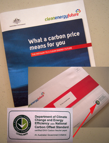
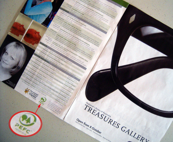
It is exasperating then to see that the address sheet that accompanies the brochure is promoting a competition that encourages recipients to opt out of receiving the printed version of the review, ostensibly for the purposes of reducing the NRMA’s carbon footprint. This is ironic given the printed publication carries the PEFC logo for sustainably-managed forests (Note, sustainable – which means they are probably helping to reduce the amount of carbon dioxide in the atmosphere) and the ISO 14001 logo for environmental management. True, it doesn’t say that it is carbon neutral but I bet it would be possible and I’ve no doubt that a company such as Offset Alpine is working to reduce it’s carbon footprint and has already done so (Later: true, they closed down completely…).

Admittedly, the competition also offers the option for members to continue receiving the printed copy and there is no explicit link made between reducing carbon emissions and reducing print – although I would suggest that the link is heavily implied, perhaps misleadingly so. Is there any evidence that reducing the print run for this publication would cut carbon emissions or is it just another example of fuzzy group enviro-think: ‘Print is bad, therefore cutting print is good’? My guess is that it is more likely to be driven by budgetary concerns than any genuine desire to do something about climate change.

If you want to get a message out, to tell a story, then print as a medium has almost unrivalled cut-though, especially when it is done well, as in this case, with compelling content and attractive design. People will look at this publication, even if only briefly, and remember it. OK, so you could make it into a pdf and stick it on a server somewhere, maybe turn it into an interactive app, and I reckon that nobody would give a stuff. And it wouldn’t do much to save the environment either (where is the power coming from to run all those servers…?)

If something is worth telling, then it’s worth doing it in print. And if you do it well, don’t be embarrassed by it and undermine all that hard work by suggesting that it is somehow bad for the environment when it’s not.

shredded paper

The linen brochure

Linen brochure

Everything I’ve read or heard about direct marketing emphasises the importance of having good quality data; if you don’t have accurate information about your target prospects then you’re simply firing off blindly, more in hope than any real expectation of striking sales success. At the very least, DM campaigns should aim to get the names and addresses of the recipients correct as nobody likes seeing their name misspelt; when it comes to making a good first impression with potential customers, not knowing what they are called is a big handicap.

On that score, this brochure that came in the post from a linen retailer is a massive fail. I’m not sure how we ended up on their list nor when but, regardless, their marketing collateral keeps turning up, the name of the addressee hopelessly misspelt, not even close. Moreover, the fact that these items keep on arriving, regardless of whether or not we respond to them (ie there are no coupons or individual offers to track response rates) suggests the retailer has no way of determining whether or not the DM is actually working, or if it is, which parts are more successful than others.

But you know what? It doesn’t really matter. That’s because all the money and the effort has gone into producing the collateral. And it shows. It looks gorgeous; precisely sculptured pictures of pillows and doonas, all swooningly still and serene. It makes me feel sleepy just looking at it. Apart from a couple of pages of colour, most of it is in white, along with about fifty shades of grey, against a backdrop of the deepest pitch black (pretty impressive for what appears to be a digital print job).

I’m continually amazed that items such as this turn up in the mail box, unbidden, unpaid, seeking my attention; 16 pages in total, nice stock, beautifully printed, full bleed, stapled, great photography – all free.

People talk about how ‘print is dead’ but really this is a golden age of print; 10, 15 years ago, something like this simply wasn’t possible – or if it was, it would have been prohibitively expensive. Now they’re giving it away.

Some DM items tick all the right boxes, making sure the data is accurate, including some sort of response mechanism, maybe linking to a PURL, ensuring the offer is relevant and targeted to my needs etc (I don’t buy many beauty products, for instance, but can’t get enough wine offers) but, in the end, all this work is let down because the actual print item is crap – boring layout, dull photographs, written by the work experience kid and cheaply printed on shit stock.

The print still matters, even if it is instantly recycled and forgotten. Just assuming that it will be thrown out is a guarantee of failure. Creating something that people might actually want to look at from an aesthetic, not just a commercial, perspective is a good place to begin.

And yes, we do still go and buy our soft stuff from this store even though they don’t know who we are.

shredded paper

The dance festival brochure

Dance festival brochure

I experienced a slight pang of nostalgia when I received this brochure in the post a few weeks back. Ripping open the plastic bag it came in, I caught a brief, intense burst of scent, the aroma of offset print – heady, slightly metallic, redolent of whirring gears and spinning rollers, the careful, precise mixing of chemicals and pigments.

It made me wonder if, in the not-too-distant future, this will become a lost sensory experience, a forgotten phenomenon in the same way that people, by and large, no longer encounter the smell of wood fires on a cold winter’s evening, the fug of a passing steam train or the stench of horse shit on our streets.

Bloody good thing too, you might say; after all, who really wants to expose themselves to such things? We’re talking about pollution here. By any measure, the right to clean air is a fairly basic human requirement.

Well yes, that’s true – modern life is a never-ending narrative of social improvement – but then again nostalgia is the residue of loss; sharp, distinctive, often imprecise and puzzling. The fact is that the smell of print is something that will probably soon be lost to future generations, not entirely, not globally, but generally.

This is due not only to the on-going shift of massive amounts of printed material to an online, digital environment but also because the printing processes themselves are changing. The latest toner-based and inkjet ink technologies that are set to replace offset printing over the next decade or so are comparatively odourless. Even offset printing itself has abandoned many of the smellier, noxious chemicals of the past so that a visit to a modern printroom is no longer the intoxicating, eye-watering olfactory experience it once was.

I often hear printers talk about the advantages of print as a ‘tactile, sensory’ medium compared to online channels, as if our consumption of digital information takes place in a sterile, almost telepathic, environment. It’s not true of course. We use our sight for both media, and both books and tablets require touching. Indeed, it could be argued that the ‘swipe’ of a touchscreen is a more sensuously enjoyable feeling than the turning of a page (which, at risk of going off at a tangent, reminds me of this sketch about page-turning which still makes me laugh).

Digital media also often engages a sense which is neglected by print – at least once the reader is past the age of about four or five – by incorporating sound into the mix.

Neither media tastes very nice, not unless you are a habitual paper-eater.

When it comes to smell, however, print wins by a nose. I’ve tried sniffing my phone and I’m not getting much from it. In some instances, printers have tried to exploit this advantage by deliberately adding specific aromas to their printed products – the old scratch ‘n’ sniff. Perhaps if somebody had thought to make newspapers smell of chocolate then the likes of Fairfax and News Ltd wouldn’t be facing the challenges they do today. Either that or chocolate consumption would have gone through the roof.

So indulge in the full sensory enjoyment of ephemera such as this dance festival brochure – beautifully printed on heavy uncoated stock – while you can. Once it’s gone, we will not smell its like again.

shredded paper

The government brochure

Government brochure

I couldn’t let this piece of Federally-funded ephemera pass by unnoticed. It is, as anybody who has been paying attention knows, the Government’s 20-page brochure outlining its plans to introduce a price on carbon pollution and what it intends to do with the money. It’s full of information. And ● bullet points. And break-out boxes for ease of reading. As you might expect, the colour green features regularly and prominently.

It’s amazingly well-printed on uncoated stock by PMP Print in Melbourne. The pics have neat little drop shadows. The clouds in the sky are light and airy. The bare branches of the tree are stark and woody. They really should get a prize for doing that. It’s glued rather than stitched, which is unusual.

Anyway, all that is by-the-by because the thing that really caught my eye is the little logo on the back page announcing that it was printed on ENVI, a special paper produced by Australian Paper that has been certified carbon neutral under the Australian National Carbon Offset Standard (NCOS). No surprises, I guess, that, in this instance, the Department of Climate Change and Energy Efficiency decided to use a paper that has been certified carbon neutral by its own standard. What choice did they have? The word is that the government paid about 10% more for the paper.

Mind you, ENVI is not without its critics and Australian Paper has been in the news recently for its continued use of native forestry timber which threatens its Forest Stewardship Council (FSC) accreditation.

The road to sustainability is paved with good intentions, half-truths and contradictions. In this case, the DoCC obviously thought it was doing the right thing by choosing a carbon neutral paper for their brochure, but what it also does is draw attention to the fact that the paper and its manufacturer have been accused of ‘greenwashing’ and destroying native forest – which is perhaps not the best way to kick start a new scheme designed to combat carbon pollution.

So, on the one hand, the government gets a tick for using a paper that offsets the carbon produced during its manufacture and from a company which has accreditation for responsible forestry management from a world authority on the subject (although it seems to be having second thoughts). On the other hand (you can tell I’m being even-handed here), all such logos, ticks and approvals are just window dressing used to obfuscate and confuse consumers about the realities of paper manufacturing as a wasteful, dirty, destructive industry.

I’m on the side of paper here, even though it’s not perfect, because:

  • I like it
  • I’ve always used it (although I can change)
  • I believe that paper production can be sustainable using renewable, reusable resources with a manageable environmental impact (OK, so this may be based more on hope than history, but we can all change)
  • I don’t think other media are much better despite the widespread belief that online communication helps to ‘save’ the environment. Computers? Sustainable? Pfft.
  • Paper is easy to use, low-tech, cheap, accessible, democratic, ubiquitous and it works – it is very good at communicating messages (a means to an end).

Carbon offsets are not perfect, FSC accreditation is not perfect by any means, but they are attempts to address serious problems in an imperfect world. In the long run, it’s probably better to print a brochure such as this using ENVI than not to print it at all. It could be better but it’s better than nothing.

shredded paper

The tourism brochure

Tourism brochure

Today’s ephemera fell out of one of the newspapers – it’s a 16 A4-page glossy heatset brochure, trimmed and stitched, promoting Canberra tourism. It’s quite a substantial piece of work, lots of colour photographs and full bleeds, remarkable really that 16 pages of shiny bright ink on glossy paper should be given away for free, just like that. Obviously somebody thinks there is value in doing so.

The bit that caught my eye was the little green PEFC (Programme for the Endorsement of Forest Certification) logo that appears towards the back. This tells us that the brochure was printed on paper sourced from forests that meet the requirements of the PEFC for sustainability, and that it was printed in Sydney by Offset Alpine. The little number underneath the logo – 21-31-05 – is exclusive to Offset Alpine as part of its membership of the PEFC scheme. Other printers and paper suppliers have different numbers.

All well and good but I wonder sometimes about the value of putting these blobby green logos on printed material. Who is this for? Not the readers, most of whom would have no idea what the logo means and what PEFC stands for, and presumably not the client who must already know or have specified the PEFC-approved paper. Perhaps it’s to remind them of their green credentials, in case they forget.

Sure, let’s spread the message about the sustainability of print – it’s a good story – but this type of enviro-branding doesn’t cut it for me. What’s wrong with saying ‘Printed by Offset Alpine on paper from sustainably-managed forests approved by PEFC’, or some such thing? OK, so it’s a bit long-winded but at least it says something. But then, hey, what do I know about branding? [Please feel free to reply ‘SFA’ below]

shredded paper