Archives: Packaging

The post-modern curry sauce packet

Post-modern curry packet

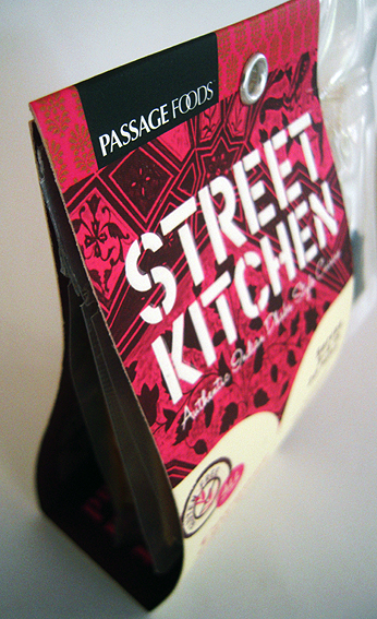
This is an example of the current trend in post-modern packaging whereby the carton isn’t really a carton at all – look, no sides, no lid– but just a beefed-up label which has been pressed into service to act as a package.

Basically it’s just a strip of cardboard with a couple of folds and a rivet to hold it together. Not much more than a swing-tag label really. Very deconstructed.

Curry packet detail

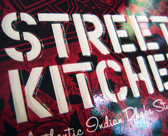
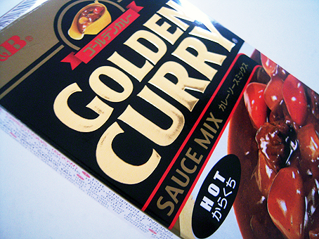
It does feature a combination of matt and gloss varnishes, however, and the main Street Kitchen lettering is actually embossed to give it a tactile Braille-like effect (as also used on this curry sauce packet – maybe that’s another trend). So even though the packaging itself is fairly low-tech as a piece of engineering, the finish is more involved than might be expected of a curry sauce packet.

Boundaries are being blurred, age-old differences between packaging and labels are crumbling, so that what we have today is the cross-over package/label, neither one thing nor t’other but rather both.

shredded paper

The curry sauce packet

Curry sauce pack

I’ve noted previously the tendency to use gold and silver foil on items of packaging which are otherwise remarkably prosaic and utilitarian. In this instance, it is amazing to see gold foil and embossing on something as humble as a curry sauce packet.

Mind you, if I made a curry sauce called Golden Curry then I reckon I’d be reaching for the foil too.

Moreover it is from Japan where they take their packaging very seriously indeed and produce it to an exceptionally high standard.

But it’s overkill, you might say, and unnecessary because it’s unlikely to make you want to increase your consumption of curry sauce.

Maybe. One day though we’ll all be using replicators to make our curry sauce and when that happens there will be a minuscule loss, a tiny gap marking the absence of shiny cheerful stuff to catch the eye and brighten our dull, grey days.

shredded paper

The light bulb box

Light bulb carton

I like this shiny rainbow effect on packaging but it’s interesting that, in this instance, it is being used for something as humdrum as an information panel. On a light-bulb carton.

The panel is overprinted in black and has its own little drop shadow to make it stand out but, at the same time, it is located on the lid of the box which is perhaps not the surface most visible on the shelf to the passing shopper.

I’m always intrigued by unusual finishing effects, like this use of foil on a lunch bag or the 3D effect on this toothpaste package, not least because they are sometimes employed in the most unlikely places. Most shoppers, I hazard, would not even notice though, especially on a disposable item such as a light bulb box, so I wonder if the effect is entirely subliminal, a brief recognition of something shiny and pretty without registering what it is.

shredded paper

The chip bag

A small chip bag

It used to be, many moons ago, the only thing you’d see written on your chip paper was yesterday’s news. Not any more.

The 21st century chip wrapper comes printed with helpful nutritional information which breaks the chip down into its constituent parts – so much fat, protein, carbs etc – until the humble little fry disappears beneath a pile of its own stats.

This is useful, of course, if you are inclined to track such data, perhaps with a view to reducing the total amount of fat, protein, carbs etc you consume. Very handy indeed. Thank you chip bag for your assistance. But I’m guessing too, if that is your inclination – your bag so to speak –  then maybe bags of chips are not where you should be. Not too often anyway.

shredded paper

The prawn cracker box

The cracker box

This box for prawn crackers from China is a wonder. That prawn looks like it could sink a battleship, and whoever thought up Pandaroo deserves a medal. When Australia finally becomes an outlying province of The People’s Republic of China, I vote that we adopt the Pandaroo logo as our new coat of arms (I will have a vote, won’t I?).

As a piece of packaging, it highlights how far today’s carton printing has come – as in, this is what it used to be like. It is a fairly basic four-colour print job, no special foils or varnishes. I doubt if it has been brand-tested to within an inch of its life. It includes just the barest of information, sufficient to meet regulatory requirements. There’s no danger of information overload in terms of spurious health claims, environmental boasts, recipe suggestions or website addresses.

Cracker box logo
Meaningless green logo

The only nod towards current environmental concerns is a rather meaningless green logo on the front which could be anything but which most likely means that the box can be recycled. I don’t reckon it’s making any great claims in terms of sustainable production. A couple of other logos on the other side indicate that it has been certified by UKAS for quality assurance and food safety (phew!).

I was going to call it retro packaging but that implies a self-conscious harking back to an out-moded form. I don’t think there’s anything calculated or ironic about this box. It’s not trying to be something else.

And that’s why I like it. The great burden of today’s packaging is that it must stand out on the shelf – shouting, shining, dazzling, alluring. Some brands do it by being iconic, unique, instantly recognisable. The prawn cracker box does it without even trying. There may not be any special effects to catch my eye but I’d know that daggy old MCY gradient anywhere.

Now I wonder what you’d get if you did cross a panda with a kangaroo… A stripy jumper?

shredded paper