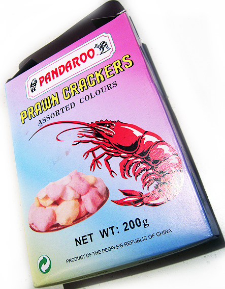
This box for prawn crackers from China is a wonder. That prawn looks like it could sink a battleship, and whoever thought up Pandaroo deserves a medal. When Australia finally becomes an outlying province of The People’s Republic of China, I vote that we adopt the Pandaroo logo as our new coat of arms (I will have a vote, won’t I?).
As a piece of packaging, it highlights how far today’s carton printing has come – as in, this is what it used to be like. It is a fairly basic four-colour print job, no special foils or varnishes. I doubt if it has been brand-tested to within an inch of its life. It includes just the barest of information, sufficient to meet regulatory requirements. There’s no danger of information overload in terms of spurious health claims, environmental boasts, recipe suggestions or website addresses.
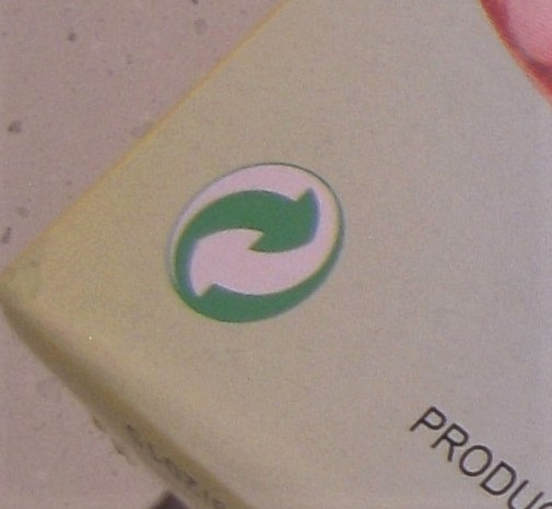
The only nod towards current environmental concerns is a rather meaningless green logo on the front which could be anything but which most likely means that the box can be recycled. I don’t reckon it’s making any great claims in terms of sustainable production. A couple of other logos on the other side indicate that it has been certified by UKAS for quality assurance and food safety (phew!).
I was going to call it retro packaging but that implies a self-conscious harking back to an out-moded form. I don’t think there’s anything calculated or ironic about this box. It’s not trying to be something else.
And that’s why I like it. The great burden of today’s packaging is that it must stand out on the shelf – shouting, shining, dazzling, alluring. Some brands do it by being iconic, unique, instantly recognisable. The prawn cracker box does it without even trying. There may not be any special effects to catch my eye but I’d know that daggy old MCY gradient anywhere.
Now I wonder what you’d get if you did cross a panda with a kangaroo… A stripy jumper?

I wonder, what is this ? a crackers ?