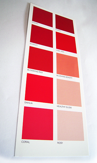
This one is quite neat because it’s not what you might think it is at first glance. It looks like a paint colour selector – because it’s meant to – but in fact it’s a direct mail piece from a bank advertising its home loan. The giveaway is that fact that one of the reds is the corporate colours of the bank, while all the other reds have fairly banal reddish names such as Cherry, Rosy, Scarlet, the likes of which would never be used on a real colour chart.
Also, on the reverse side, it tells you that it’s from a bank.
The piece is being used to sell the bank’s limited time special interest rate offer, along the lines of while the painting can wait, locking in your home loan etc… OK, so it’s not earth-shattering but I haven’t seen it before.
There are lots of ways in which potential customers might be urged to act quickly – racing for a finishing line, getting in before the doors close – so I like the subtlety of a simple DL-size piece that gets its message across using only shades of red.
I’ve written about ‘red’ as a corporate colour previously but, in this case it does appear that the red is a special – PMS 1795. It’s interesting to see a corporate colour scheme being used in this way, as part of an actual marketing message, when typically the identity police frown on it being used for anything other than branding purposes.
So hats off then for coming up with a clever concept for a direct marketing item, something which is all too easy to get wrong. Plus, if you wanted, you could always use it to select a paint colour for that feature wall…


