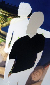
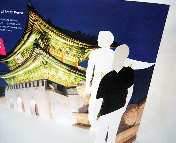
There’s an element of Mad Men with this figure, albeit reversed (black shirt, white body). It’s part of a die-cut on a promotional hand-out for a competition to win a trip to South Korea, using that time-worn appeal to ‘picture yourself here’.
 I like it but then I tend to get a little tingly with any fancy die-cut, just thinking about how the concept and design have been developed, the skill of the printing, cutting and folding so that, in this instance, the silhouette man lines up exactly with the offer inside, obscuring and then revealing. It’s simple to look at, difficult to do well.
Does it work? Who knows. There’s nothing on this hand-out to record whether it is more or less successful at generating business than any other medium.
There was a web page too for the same competition which, funnily enough, featured a different silhouette man.
I do hope it is effective though, if only because, as a consequence, it might encourage more marketers to keep die-cut print as part of their ‘communications matrix’.


