Archives: Packaging

The chip bag

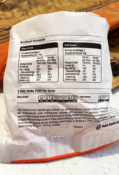
A small chip bag

It used to be, many moons ago, the only thing you’d see written on your chip paper was yesterday’s news. Not any more.

The 21st century chip wrapper comes printed with helpful nutritional information which breaks the chip down into its constituent parts – so much fat, protein, carbs etc – until the humble little fry disappears beneath a pile of its own stats.

This is useful, of course, if you are inclined to track such data, perhaps with a view to reducing the total amount of fat, protein, carbs etc you consume. Very handy indeed. Thank you chip bag for your assistance. But I’m guessing too, if that is your inclination – your bag so to speak –  then maybe bags of chips are not where you should be. Not too often anyway.

shredded paper

The prawn cracker box

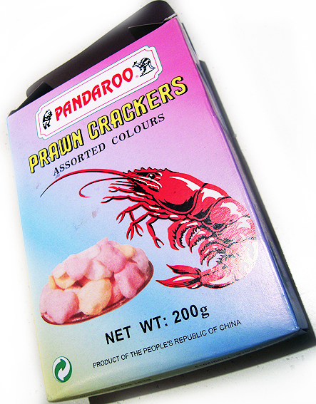
The cracker box

This box for prawn crackers from China is a wonder. That prawn looks like it could sink a battleship, and whoever thought up Pandaroo deserves a medal. When Australia finally becomes an outlying province of The People’s Republic of China, I vote that we adopt the Pandaroo logo as our new coat of arms (I will have a vote, won’t I?).

As a piece of packaging, it highlights how far today’s carton printing has come – as in, this is what it used to be like. It is a fairly basic four-colour print job, no special foils or varnishes. I doubt if it has been brand-tested to within an inch of its life. It includes just the barest of information, sufficient to meet regulatory requirements. There’s no danger of information overload in terms of spurious health claims, environmental boasts, recipe suggestions or website addresses.

Cracker box logo
Meaningless green logo

The only nod towards current environmental concerns is a rather meaningless green logo on the front which could be anything but which most likely means that the box can be recycled. I don’t reckon it’s making any great claims in terms of sustainable production. A couple of other logos on the other side indicate that it has been certified by UKAS for quality assurance and food safety (phew!).

I was going to call it retro packaging but that implies a self-conscious harking back to an out-moded form. I don’t think there’s anything calculated or ironic about this box. It’s not trying to be something else.

And that’s why I like it. The great burden of today’s packaging is that it must stand out on the shelf – shouting, shining, dazzling, alluring. Some brands do it by being iconic, unique, instantly recognisable. The prawn cracker box does it without even trying. There may not be any special effects to catch my eye but I’d know that daggy old MCY gradient anywhere.

Now I wonder what you’d get if you did cross a panda with a kangaroo… A stripy jumper?

shredded paper

The lunch bag

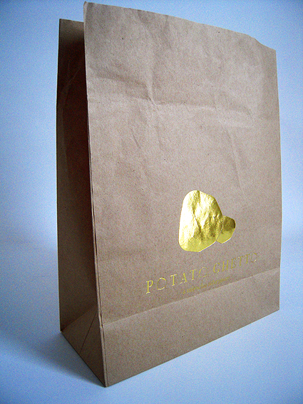
The lunch bag

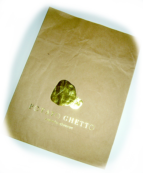
It’s not your everyday bag although, in many respects, it is indeed just an ordinary brown paper bag – but with foil on. I don’t recall having seen this combination before when munching my way through a multitude of sarnies and salads. I don’t think I’ve ever had cause previously to pause and acknowledge the foiling on my lunch bag. Perhaps I just don’t eat at the right places.

It is an odd pairing though. Foiling is still the marker for a hint of luxury or class, on everything from wedding invitations to chocolate boxes. People keep foiled stuff, almost as if the shiny bits really were valuable. So why put it on one of the most ephemeral of all paper products – the lunch bag? Typically this lasts no longer that the time it takes to scurry back to one’s desk and rip it open with the haste of a caveman slicing into a dead deer. The bag is instantly disposable, one step away from being food waste. It’s barely even paper.

The lunch bag

And yet this one has foil. It is a product of the popular misschu Vietnamese tuckshops (yes, I was there for the lemongrass beef salad) and is promoting a new eatery with a focus on potatoes (that shiny blob is meant to be two potatoes, I think, not a golden turd). The bag is produced by Gispac (‘we are bags…’), an Australian bag maker.

shredded paper

The toothpaste package

3D toothpaste package

It’s not just the movies that are going 3D; print too is becoming more 3D in appearance, at least in certain areas.

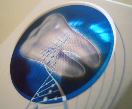
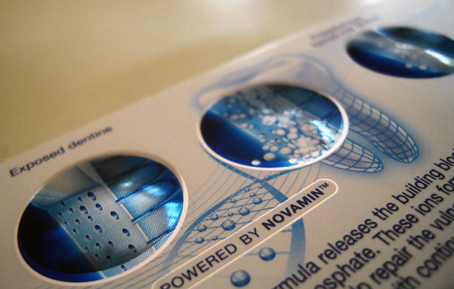
To the casual observer, those round shiny blue blobs on the outside of this toothpaste package look slightly raised (my photography perhaps doesn’t them justice but, believe me, they look like real blobs). However, as soon as you touch them, it is apparent that the surface of the box, rather than being slightly raised, is in fact perfectly flat. It’s an optical illusion, one which is created by use of a special foil applied to that part of the print. I don’t know how they do it – it must be something to do with how the light is reflected – but the effect is to make it look slightly 3D.

It’s a nice effect but rather surprising perhaps to find it being used on something as humble as a cardboard box for a tube of toothpaste. Somehow I’d have expected to see it on something that attracts a lot of eyeballs, like a movie poster or a magazine cover, but there it is anyway. A toothpaste package.

Toothpaste package

It’s worth noting too the amount of work that’s gone into this package – not just the 3D effect but the ultra-fine print and the foiling, all designed to make it shimmer and shine. Just to sell some toothpaste. Typically, this type of finish is associated with ersatz-luxury items such as chocolate or wine, products that are regarded as discretionary purchases, non-essential but nice.

Perhaps there’s a connection too between this type of ‘bling’ print and oral gratification – something that offers a sweet taste or clean teeth. Cigarette packets are another example (at least until the introduction of plain packaging).

Hair shampoo and other beauty products also get this special treatment, highlighting how important print is as a medium in relation to the body and our own sense of self-image.

shredded paper

The tea bags

Assorted tea bags

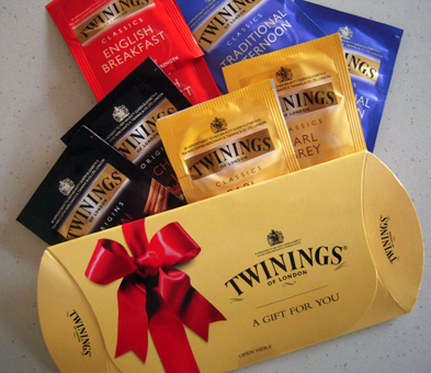
Two for tea and tea for two, la-di-da and da-di-la. This little pack of tea bags appeared in our street a while back. I didn’t get one but there were heaps piled up outside the block of flats down the road so I took one of those – sorry if you missed out on your English Breakfast.

Tea is such a prosaic, everyday item and yet, here, Twinings is casting it as an up-market product, that little bit of exclusive pleasure wrapped in a red ribbon, a special gift for you. There’s quite a deal of print involved in this freebie too and they’ve gone to a lot of trouble with it.
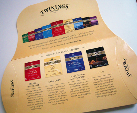
Tea bags

There’s the box itself, printed full colour inside and out with a varnish. Open the flap and, inside, all the tea bags are lined up, printed really rather finely; even on the smallest bag, the text is still legible. The yellow background is not just a flat solid but has a very subtle gradation, barely perceptible.
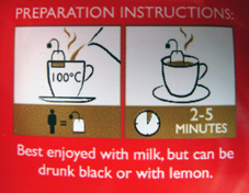
Tea bag sachet

Then there is the sachet containing the tea bag, printed on a flexible film. I like the little cartoon of instructions on the reverse side, the kettle pouring in the liquid gold and the gold vapours rising from the cup.
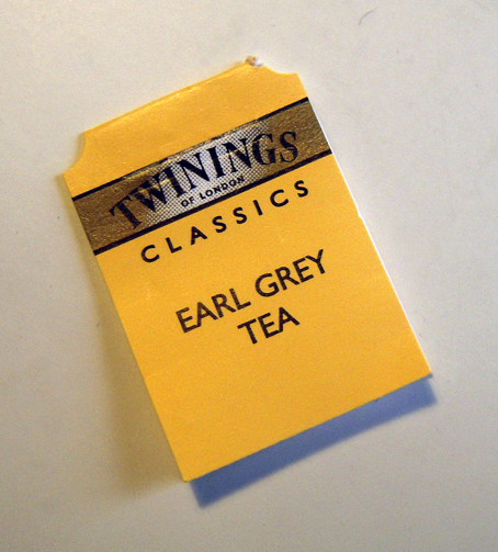
Tea bag tag

And then there is the tea bag tag, measuring no more than 3x2cm and yet the minute type of LONDON is still legible – it must be about 2 point size, at the limits of what is readable. Ultra-fine printing on a mass scale on a tag attached to a tea bag – who said tea was prosaic?

Brewed some Earl Grey for breakfast this morning and it was lovely.
shredded paper