Archives: Print

Commercial print – flyers, leaflets, catalogues and brochures. Some people call it junk

The Yellow Pages 2021

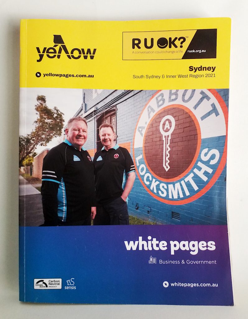
Yellow Pages cover

Back at the start of the COVID-19 pandemic, the old man next door died. It wasn’t COVID, his family said; he’d been in hospital for a while and caught pneumonia which finished him off. They held a suitably distanced funeral, family members only, and we sent flowers.

Soon after, there was a brief flurry of activity as family members emptied the house of whatever needed emptying and then the place fell silent. The old man had always been fairly quiet anyway. He lived alone and always kept himself to himself, as they say. We heard his coughing fits from time to time, in the morning and late at night, and occasionally a family member would visit and there would be a lot of shouting. Not by him, I should add. Like I said, he was pretty quiet most of the time.

Over time, the sound of his absence grew and solidified. We no longer heard him in the backyard filling his watering can from the rainwater tank, the rising pitch of gushing water so familiar I knew the instant when he would turn off the tap. The rattle of his garage roller door fell silent; the clunk of the screen door, signalling his comings and goings throughout the day like a slow metronome, was still.

For a while I collected his mail from the letterbox and shoved it under the side door away from the weather, but gradually real letters became fewer and fewer until eventually it was nothing but junk. A family member rang to tell me there was a dispute over the old man’s will, lawyers were involved, arguments prepared and so on. Time dragged on through the lockdowns. We grew used to having no one next door to us; the drawn blinds and dark windows, the over-grown lawn, the steady drip drip from the rusted guttering when it rained.

Then one day, out of the blue, the latest edition of the Yellow Pages landed on the old man’s veranda. I didn’t see it come but there it was, just lying there. We got one too, which I brought inside because… well, that’s just me… but the old man’s copy stayed on the veranda. Nobody came to pick it up. The wind blew the pages open and, on breezy days, they would flutter back and forth like a trapped bird.
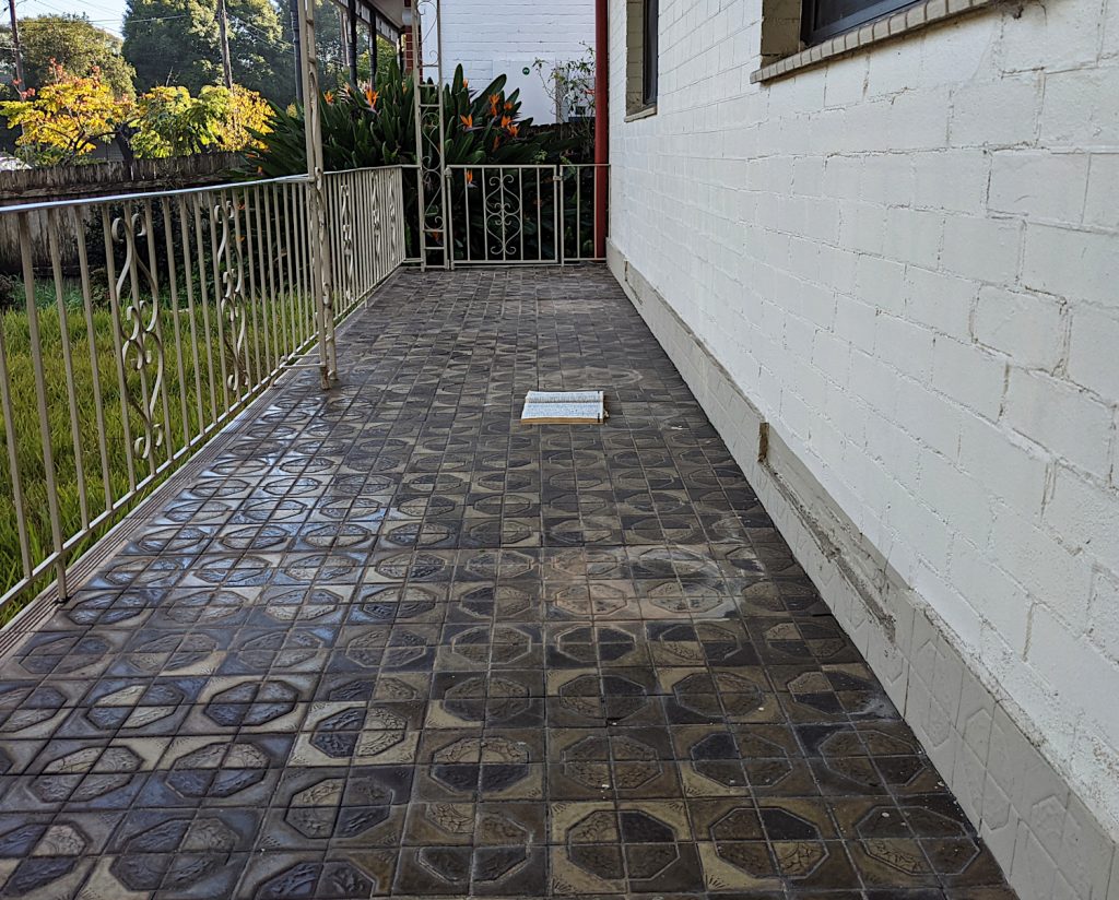
Forgotten pages on the veranda.

Why didn’t I go and pick it up? That’s a good question. I kept on meaning to go round and collect it, usually when I was at our front door and I would catch a slight wave of the pages out of the corner of my eye and I would think, ‘Oh I must go and pick up those Yellow Pages’ but then the instant I entered the house, the thought would disappear.

Over time, the pages became another symbol of the old man’s absence, like the weeds along the fence line or the unpruned roses. I’d see the pages sitting there and I’d think of him for a moment, maybe contemplate life’s inexorable progress, spinning ever faster while seemingly motionless towards an inescapable black hole. There was a lot of this sort of self-reflection going on during the pandemic.

At some point I began to wonder how long the pages might actually stay there, what it would take for them to be moved and, if they did disappear, what that might symbolise: that change is indeed possible, nay inevitable, and we’d better be prepared for whatever it might bring.

I still had my Yellow Pages of course. They’ve been an object of interest to me, on and off, for several years now, and I’ve written about them before several times over the past decade, each time with varying degrees of enthusiasm and curiosity. They are an ever-diminishing symbol of change, an embodiment of shifting patterns of production, distribution and consumption. Along with newspapers and road maps, the story of the Yellow Pages, and their sister publication the White Pages, encapsulates the declining importance of print and paper in daily life, in much the same way that a journey along the UK’s motorways used to be punctuated by huddles of coal-fired cooling towers, now all gone.

A comparison between 2013 version, the last time I looked at the Yellow Pages for this part of town, and the 2021 version illustrates this decline. Back then, the Yellow Pages alone ran for 900 pages, in itself much reduced from previous versions. This time around, the complete book is only 310 pages in total – and that includes both the Yellow Pages and the White Pages for business and government. The Yellow Pages alone are less than 200 pages, and even that seems like a lot.
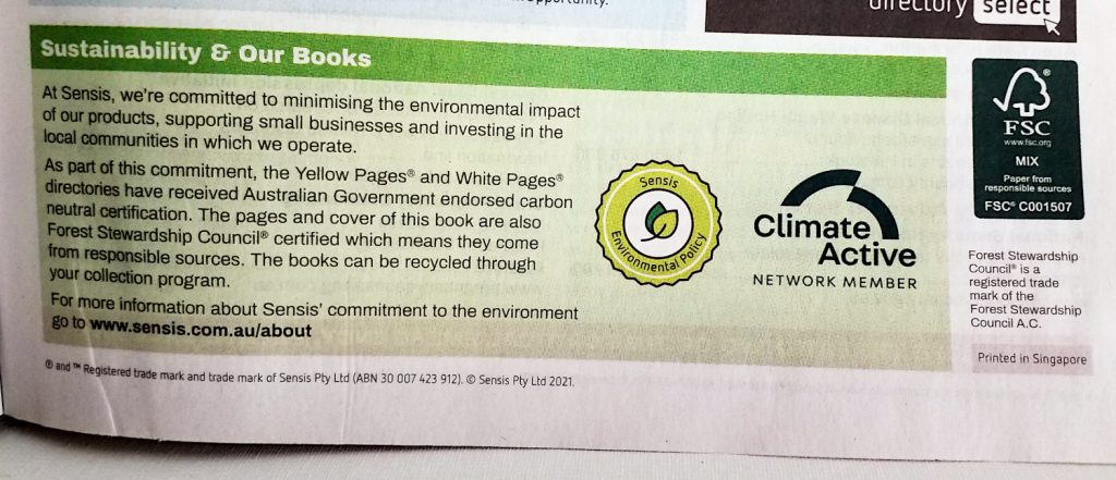
YP environmental logos
As usual, the Yellow Pages wear their environmental credentials proudly – carbon neutral, FSC certified paper and, of course, completely recyclable.

There are parts of the directory which I really like for their simplicity and ease of use, such as the double-page spread of emergency numbers listing every possible helpline and support service you could ever want – handy in an emergency if you knew where to look (or if the internet is down). Some of the information which used to be included, such as area dialling codes and post codes, is now absent – you’ll need to look online for those.
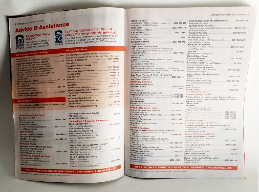
YP emergency numbers
A double page spread of contacts to cover all emergencies.

Of course, the Yellow Pages have traditionally been the home of the tradie. That’s where you went to let your fingers do the walking if you wanted to find a local plumber or electrician, and you could be guaranteed to find page after page of tightly-packed entries all jostling for attention. Today their numbers have thinned out considerably. The plumbers & gasfitters section spans no more than six pages, and three of those are full page ads; electrical contractors take up less than three pages. Doctors occupy the most real estate (10 pages – which may have something to do with each doctor in a practice getting their own listing) followed by dentists (six pages). Maybe medical practitioners are more conservative when it comes to their media buying.

In the White Pages section, the main item of interest, for me at least, is in seeing if businesses are still using the time-honoured marketing practice of inserting AAAAAAA into their names in order to get to the front of the queue. Even in 2021, it seems the answer is yes.

So, for instance, the first entry is A AAAAAA Carpet Complete Restorations, closely followed by our old favourite A. (Aaaaaardvark) Mechanic. Despite this, it does look as if the number of aardvarks (or rather Aaaaaaardvarks) is greatly reduced and could be on the verge of extinction. Save the Aaaaaaardvarks I say.

Other examples of this technique are A Aachoo Sydney Hire Storage Removals and, one of my favourites, A Aadworkin Roofer, which manages to combine two forms of self-promotion in a single name.

Interestingly, the locksmiths featured on the cover of this edition, A. Abbott Locksmiths, are also in the first dozen entries, which makes me wonder if Sensis (now called Thryv since being taken over ), when looking for a suitable front cover story, simply started going down the listings alphabetically until they got lucky – you see, the system works! (What am I thinking? It’s the Yellow Pages – of course they paid for it.) And in case you’re wondering, A. Abbott Locksmiths is owned and run by a family called Polley.

It’s important when using this technique to stipulate that the first word of the company name is a single A followed by multiple As, otherwise the name gets bumped down the list behind all the other single As. So, for example, Aaaa Anytime On Time Plumbing is on page 2 of the listings simply because they didn’t call themselves A Aaaa Anytime On Time Plumbing – which is probably not the outcome they were expecting but, nevertheless, it’s one shared by numerous other AAA listers.

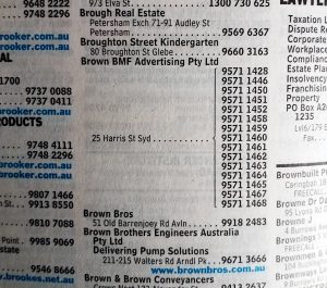
There are other ways of trying to stand out in the listings – bold type, boxes and background tints – but another technique is simply to list the number of every extension in the company without highlighting the main switchboard number. This will get you more column inches than simply listing a single number, even if it is more confusing for the punter. There are two ways to do this. One is to list every number but with only one address:

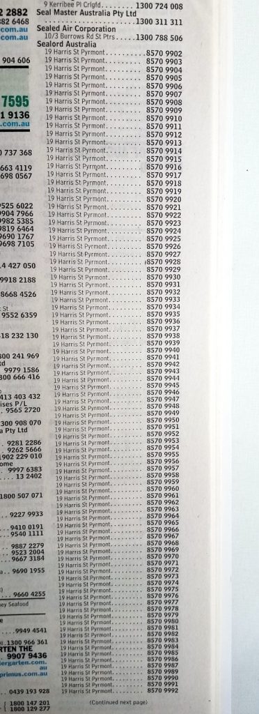
The other is to list all the numbers with the same address so the sheer repetition of the same characters leaps off the page:

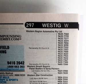
If you are going to do it this way, it helps to get the company name correct – if you want to avoid looking like a real Jan.
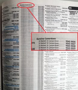
Pro tip: try to get the company name right – it’s Euroline Camperdown not Camerdown.

Is there a future for these printed listings or is it all just more dead paper? Thryv would like you to believe that buyers still use the print book (More than 1 in 4 Aussies use the Yellow Pages Book every year, they claim) but elsewhere the writing is on the wall: the final printed editions of the Yellow Pages in the UK were delivered in 2019.

The old man’s Yellow Pages eventually disappeared too; the lawn was mowed, the blinds raised to let in the light, and a For Sale sign appeared at the front. Within weeks a new family had moved in and the last few remaining traces of the old man were swept away like yellow leaves blowing in the wind.

The boring logo

Soteria logo

Let me seduce you into trusting me by being so bland, so innocuous that I will easily lull you into a state of blessed relief.

One might think that the function of a logo and associated corporate branding is to stand out from the crowd, to do a little dance and shimmy in order to catch the eye and make a lasting impression. A good logo is worth its weight in golden arches, able to connect instantly with its target prey… err, audience, and engender all those positive feelings of association, desire and, ultimately, consumption.

But not in this case. It would be a challenge to come up with a logo any more insipid or meaningless – and if you did, it would probably, perversely, be quite a bit more interesting. This has just the right degree of instant forgettability, the design equivalent of a backbencher’s speech (or a blog), existing for its own sake but barely noticed by anybody. But why?

God knows there are enough boring logos out there without anybody deliberately trying to add to the pile, but this one is so anonymous as to suggest it is part of a calculated strategy. And what of the brand name? I defy anybody to tell me, from the name alone, what this company is selling. It really is a mark of genius to come up with a name that evokes almost no connotations at all, neither good nor bad, positive or negative. It exists in its own perfectly poised bubble of meaninglessness.

I could say something about the colours too – a dominant blue and a highlight colour which is another… I dunno, maybe another kind of blue? We all know about blue though. Calming, safe, secure, reliable – so perhaps this gives you a clue as to where this is all going.

Let’s open it up anyway (it’s an A4 roll fold to DL size) and see the reveal.

Soteria inside copy

You see, that in itself is a kind of brilliance. Expert advice, solutions, experience… and still I have no idea what they are selling. It’s almost as if they don’t want me to know what they do. I might even have to call them up to find out. It’s got to be an arms dealer eh? Or a company that wants to take away my nuclear waste.

Soteria leafletOpening up the whole piece gives the game away immediately with a cartoon image of a man kicking a wrecking ball of DEBT while his family safely make their way home to a little suburban house. It’s about money – or rather that largely taboo topic of personal financing: debt. Crushing debt. Debt that is about smash our lives and destroy everything we’ve worked so hard to accumulate. Debt that threatens to annihilate who we are. An existential level of debt that consumes everything in its path.

Now it all makes sense; the low-key approach, the deliberate avoidance of any razzle-dazzle or blowing of trumpets. The key word here is stress; this is already a highly-charged situation (if you’re the person to whom this leaflet is speaking) so the goal is not to inject more emotion into the proposition, to hype it up, but rather to drain it all away. Make it seem totally normal, boring, manageable. Unremarkable.

The rest of the flyer is just text in the form of a letter which, again, is quite noteworthy for what it does. Nobody reads this much, do they? Not in an advertising flyer anyway. Even with the inclusion of four bullet points to break it up a bit, that’s a lot of words to consume.

Soteria text

The whole thing is crafted to be quietly soothing, professional and authoritative. Peace of mind is mentioned a couple of times. It speaks of helping people ‘who find themselves in mortgage stress’ as if, lo and behold, they suddenly woke up one morning and found themselves surrounded by a thicket of missed payments. Shit, where did all this fucking debt come from?

One sentence in particular is worth quoting, just for the way it breaks all the rules of snappy, incisive copy writing:

We understand how stressful it can be to be under financial pressure so we’ve developed a completely different business model that puts you at the heart of the process to develop a solution tailored to your unique situation that really works to remove the stress.

Wow. I don’t know what it means exactly but at the end of it I’m too exhausted to offer any resistance. Whatever it is they’re handing out, I want some of it.

I understand, too, how such word assemblages work, if only because I’m equally guilty of writing swathes of similarly meaningless buzzword-heavy text blobs which sound as if they’re groping towards an insight of staggering significance without, ultimately, really saying anything at all.

Just a side note – it’s interesting how often hyperlinks are preserved in printed document these days, underlined and in a different font colour, as happens with the company website address here. It’s probably because the document was originally created as a pdf which kept the link and its styling. We’re so blinded to it now nobody notices to take it out even when the functionality no longer exists.

Overall, I now have a vague idea about what Soteria does although the main take-away I get from this leaflet is that they are expertly skilled in tackling something that people really don’t want to have to deal with and then simply boring it into submission.

Yeah, I can relate to that.

shredded paper

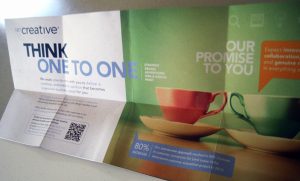
The folded box

A folded box

I know working in advertising and marketing is all deadset glamorous and everything – so much creativity you can barely contain it within four walls, not forgetting all those freebies and long lunches – but sometimes it is also just sitting around the boardroom table trying to come up with new ideas and somebody says, ‘Well, you know how we’re always trying to show we can think outside the box, well.. why don’t we make an actual box and…’

And maybe that will also be one of those days when nobody can come with anything better (it’s a Monday morning, the trains are on strike, your favourite barista is on holiday…) so you go along with it anyway because, you know, it’s better than nothing, and everybody heads back to their desks trying to ignore that niggling voice which asks how did I end up here anyway? Is this really what I thought it would be like? What does it all mean?

And so eventually, after much toing and froing, there is an actual piece of paper folded like a box and on the outside it says ‘Think outside…’ even though the person looking at the box is already outside it, presumably thinking to themselves ‘What the hell is this?’, and what the box really wants from you is to look inside the box. Please

And it’s not even a real box anyway, not like an origami box you can actually put things in. It’s more like a double gatefold with flap. It’s a nice fold, a bit out of the ordinary, probably costs a bit extra. But it’s not a box.

Does that matter? It’s advertising so we know it’s all lies anyway – supposedly beautifully told but sometimes prosaically, half-heartedly, as if nobody really stopped to think about what it was they were doing or trying to say anyway.

This piece is produced as a self-promotion by an agency called 121 Creative which claims that what differentiates it from other agencies is its ‘one-to-one approach’. 121 – geddit? So if it’s one-to-two you’re after, no way, they don’t want to know about it, and if you’re expecting two-to-one then, please, look elsewhere. It’s One. To. One. OK?

Today, the notion of thinking outside the box is a cliché for avoiding conventional thought processes, usually in relation to management practices. Originally though, the phrase had a slightly different meaning. The ‘box’ is a reference to the common boxwood (Buxus semperveritas) often used as a hedgerow plant in England, especially for creating mazes. To think ‘outside the box’ therefore was to be outside the maze, wandering without aim or purpose – essentially unconstrained and somewhat feral.

When I hear the phrase these days, typically as a hackneyed reference to doing the same old thing under a different guise, I do somewhat yearn for a return to that original wildness, when thinking outside the box really did mean being out of bounds, off with the fairies and beyond the pale.

The die-cut man

The die-cut man

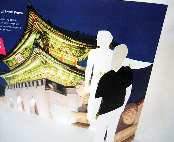
There’s an element of Mad Men with this figure, albeit reversed (black shirt, white body). It’s part of a die-cut on a promotional hand-out for a competition to win a trip to South Korea, using that time-worn appeal to ‘picture yourself here’.

Die-cut monochrome manI like it but then I tend to get a little tingly with any fancy die-cut, just thinking about how the concept and design have been developed, the skill of the printing, cutting and folding so that, in this instance, the silhouette man lines up exactly with the offer inside, obscuring and then revealing. It’s simple to look at, difficult to do well.

Does it work? Who knows. There’s nothing on this hand-out to record whether it is more or less successful at generating business than any other medium.

There was a web page too for the same competition which, funnily enough, featured a different silhouette man.

I do hope it is effective though, if only because, as a consequence, it might encourage more marketers to keep die-cut print as part of their ‘communications matrix’.

shredded paper

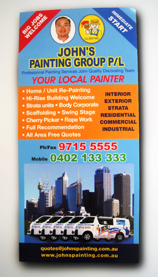
The house painter’s flyer

House painter's flyer

The thing that caught my eye with this flyer from John’s Painting Group is how the ‘Before and After’ photos of the house on the reverse side look suspiciously as if they have been created in Photoshop.

House painting before and afterOh, if only house painting was as simple as adjusting a brightness slider on a computer screen. We could all do it then and what is, in reality, a laborious and tedious job would be all over in seconds.

Of course, there’s no reason to doubt that John’s Painting Group really did paint the outside of this house and, in the process, managed to simultaneously brighten the sky and lighten the dark shadows creeping across the lawn.

If that is the case then what is truly remarkable here is that John not only managed to take his photos at the same time and on the same day (a year apart presumably, giving him time to actually do the painting) so that the shadows match exactly, but that he also managed to capture identical clouds in the sky.

That is an impressive feat, almost miraculous one might say, and just one reason why John should be entrusted with not only painting the house but many other difficult tasks as well – such as combating climate change, eradicating world poverty and getting passengers to remain seated until the seatbelt sign has been turned off.

shredded paper