Archives: Booklets

The Biennale booklet

Biennale booklet

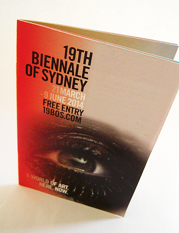
Like other cultural festivals, the Biennale of Sydney generates a stack of print, what with its catalogues and guides – substantial publications – as well as a host of pamphlets and postcards and flyers, not forgetting all the maps, signage, banners and print advertising as well. For a brief, intense period, an event such as the Biennale is a queen bee of print, busily disseminating a plethora of paper products.

For example, according to the organisers, about 30,000 of these mini-guides were produced in the lead-up to the 19th Biennale and distributed through the Avant Card network.

This is all part of the modern economy of print. As governments and corporations cut back on the amount of print they deliver to customers – because print is seen as a cost – mass cultural events which are largely funded by tax-payers and large corporations (the Biennale receives over 60 per cent of its funding from these sources) become a means by which these organisations can promote themselves in the print media.

Nobody is going to look twice at a brochure put out by a government department, council or corporation, but supporting an event such as the Biennale in print, when people are actively looking for information, is a sure-fire means of garnering positive attention.

shredded paper

The green paper guide

Green paper guide

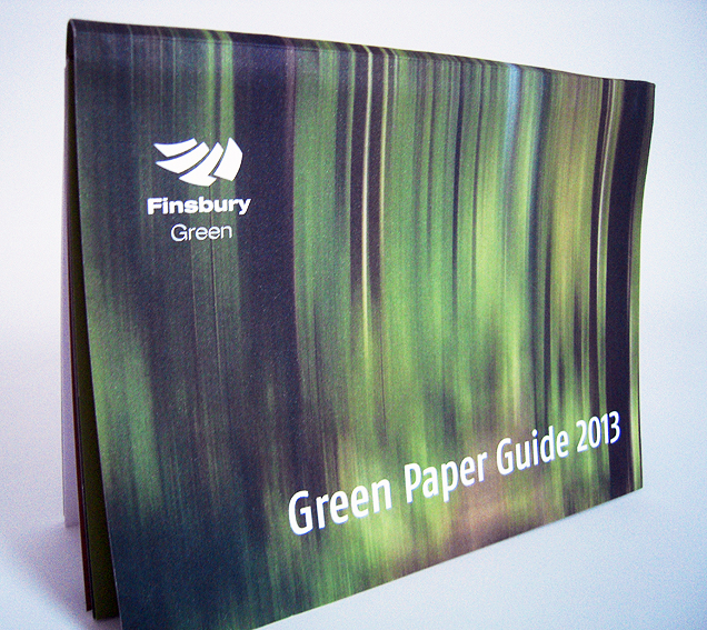
This is the Finsbury Green guide to ‘green’ paper which is not green paper as such but rather paper which is… oh, you know what I mean.

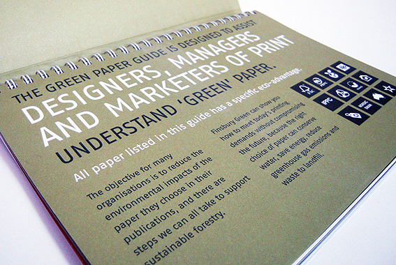
It’s pro-paper, obviously, coming from a printer, and doesn’t stray too far from the accepted formulations about paper as a sustainable resource derived from certified forests etc. It’s got good information about paper types and the various certification schemes and symbols. This kind of resource used to be produced by the paper merchants but because this one is put out by a printer, it’s a bit more broad-based and comprehensive in terms of the papers it covers.

It’s interesting in a paper kind of way. Of course, the one thing it doesn’t include is pricing. That’s fair enough; price is always negotiable when it comes to paper. The point is, for many paper users, it will also be the important criteria for purchase, regardless of any good intentions about saving the environment. Not everybody will buy on price – some will put always environmental factors foremost – but, for a significant number, budget is a constraining factor.

You can argue about the environmental ins and outs of paper production until you go green in the face but if users aren’t prepared to pay for it or, even more insidiously, use environmental concerns as an excuse for cost-cutting with digital media, then ultimately you may as well go and tell it to the trees.

Green paper guide

That’s the sad thing about publications like this one, for all their usefulness and desire to educate and inform; there’s a discomfiting sense that the green paper boat, so to speak, has already sailed.

I don’t think it’s going to convince anybody or change minds but it’s a useful aid for people who are already committed to paper. Available from Finsbury Green.

shredded paper

The Sydney Festival booklet

Sydney Festival brochure

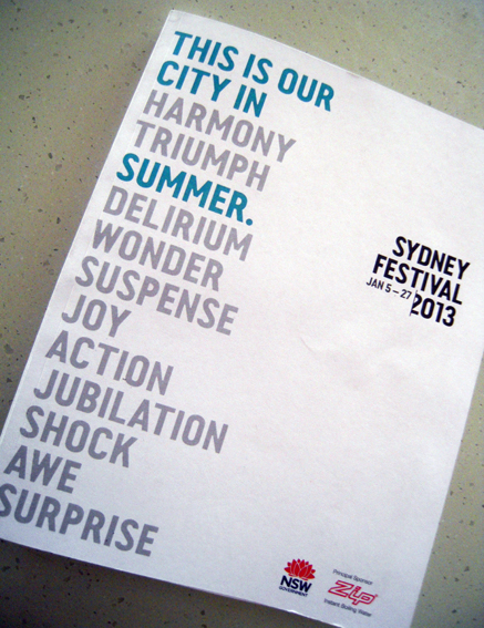
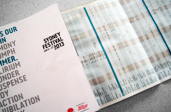
I picked up this booklet in the pub, I think, 136 pages with cover, roughly A5-size, perfect bound, printed by PMP Print in Sydney on uncoated stock. It’s got lots of solid black ink and small reversed-out type, quite impressive, given the speed at which it must have been printed. It’s even got a bound-in three-page fold-out at the back for a calendar of events; point size must be about 6 or 7, rather squinty for my tired eyes but very skilfully done. There’s a lot of information here in a tiny book and it looks attractive.
Sydney Festival booklet

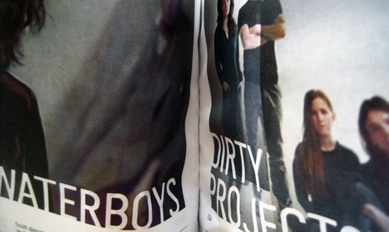
The thing that struck me about it though, when I picked it up, was just how noisy it was. I think somebody must have spilt their beer on it and then it dried out, making the paper hard and crisp. Turning the pages produces a sound like ice breaking. In some parts the paper is so stiff, it’s hard to open the booklet at all without cracking the spine. At first I thought it might be a binding fault but it’s more likely to be because the pages have swollen, being drunk on ale. I hope so anyway.
Sydney festival brochure

It got me thinking though about the sound of print. Much is made about the sensory appeal of print over digital media – too much in my view – but it’s usually accepted that sound, along with taste, is not one of those sensory attractions. Why not? The swish of a page being turned. The rustle of the newspaper being folded. The clicking of pages being riffled. The thud of a book being closed. These are all distinctive sounds, unique to the activity of consuming printed material.

When culture is in the process of being consumed, it is mainly about the content: what’s the story, how does it make you feel, what does it all mean? When culture is looked at historically, however, it’s all about context – what was it like? The content of Shakespeare doesn’t change (well, not much) depending on whether it is performed at the RSC or the new Globe theatre but the experience is different; the latter tells us something about what it was like ‘in Shakespeare’s day’ ie what it was like to consume culture before history intervened.

The content of books doesn’t change in the shift from paper to digital production (for existing ones anyway – new ones are may be different) but the experience of consuming them is altered, and that means the culture changes as a result.  A group of sounds – familiar, evocative – disappears; a part of the aural culture fades out of earshot. The experience of opening a little book and hearing the pages crack will become as unique to me as readers of yore having to slice uncut pages (something I have only had to do once).

Perhaps, in years to come, when we are living in outer space and all information is automatically fed to our brains via digital implants, there will be museums or libraries with recordings of lost paper sounds so people experience what it was like to use real paper-based products (much in the same way that visitors to Jorvik can experience the sights, sounds and smells of a Viking settlement).

shredded paper

The label expo booklet

Label exhibition brochure

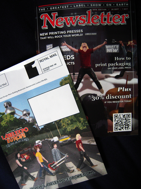
This little A5-size booklet arrived from Europe a few weeks ago advertising an upcoming label show in Brussels. It’s a show, a ‘live’ show, so that explains the rock ‘n’ roll theme including copying the Rolling Stone masthead style, although I think they could have come up with a better title than Newsletter – that’s what it is, not the title. It’s like calling your magazine, Magazine – and no doubt someone has done that too.

OK. So where was I? Oh yes, the rock ‘n’ roll theme. It’s also used on the address sheet which features a cartoon version (calling it a ‘parody’ flatters it) of the Beatles Abbey Road cover except it looks more like Bon Jovi crossing the road and Abbey Road is now in Belgium because that’s the Atomium in the background. Then again, one of the band is carrying a double-neck guitar so maybe it’s meant to be Led Zeppelin and they are looking for a Stairway to Heaven. The white VW Beetle on the Abbey Road cover has become a Citroen 2CV while the black police van has turned into a yellow taxi. On the cover of the booklet, the T-shirt of the lead singer with his back to the crowd reads ‘Rock Your Labels Off’.

I get the rock ‘n’ roll thing but the Beatles-reincarnated-as-Led-Zeppelin-on-Abbey-Road-in-Brussels spin is just too confusing for Simple Minds like mine. Still, someone’s having fun.

shredded paper

The Qantas booklet

Qantas booklet

This little item from Qantas survived a couple of days in the letter box during the recent heavy rain and emerged with just a few damp patches. Impressive. I don’t know what they use to make this paper stuff but it sure is tough. (Just kidding – of course I know what goes into paper: the silent screams of Sumatran tigers and the soft exhalations of sad-eyed Orang-utans).

The marketing message itself is a soggy lettuce leaf of an idea that looks limp on the first page and then, embarrassingly, has to keep going for another 10 pages or so. It’s so weak it makes the Terms & Conditions page look interesting. No doubt it made a good pitch at the monthly S&M meeting but it’s only really speaking to those same people who think that what they’re selling is cool. Sometimes marketing departments just need to sit up and take a look at the world around them.

Anyway, it got me thinking about the colour red. Specifically the Qantas red. What a red it is, a true-blue Aussie red, appearing on everything from rugby shirts to credit cards, not forgetting the oceans of it applied to the tail fins of large aeroplanes. It’s a red that speaks to the heart of a nation of travellers, summoning up images of sunsets over the outback, the red dirt beneath our feet. How many Australians in distant lands have felt a tug on their heart strings when, noses pressed against the departure lounge window, they catch a first glimpse of Qantas red on the plane that will carry them safely home? I don’t know the exact figure but I imagine it’s a lot.

Such a powerful red deserves its own brand name (I’m calling it Q-Red) and that special reverence reserved only for the most iconic marketing concepts. I wonder how many man-hours went into developing Q-Red, subtly adjusting the shade and hue to arrive at the exactly the right effect. I imagine Don Draper himself mixed the colours while dragging on a Lucky Stripe and sipping his third lunch-time Martini. It must be one of the most jealously-guarded branding formulas in marketing, like Cadbury purple or Q-Red’s distant relation, Coca Cola red.

How deflating then to discover that Q-Red doesn’t look all that special after all. Judging by the mis-registration on this booklet, Q-Red is Simply Red, a mix of 100% magenta and yellow. That’s it. Red.  A primary colour. Something so basic it excites only a third of our colour receptors. How simple is that? And what lazy marketing. I’m outraged that one of our national brand colours is nothing more than ordinary red. How typically Australian too.

“What colour do you want to use to define your national carrier?”

“Aw, red’ll do. She’ll be right.”

From now on, I’ll never look at Qantas red – I’m too embarrassed to call it Q-Red any longer – in the same way. As far as I’m concerned, it’s just red and that’s all I’m seeing.

shredded paper