Archives: Cards and leaflets

The lost money flyer

Lost money flyer

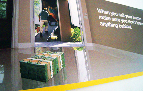
This is from the same people, I think, who brought us the duck in the bathroom.

This time around it’s a useful reminder not to leave wads of cash lying around on the floor when you move house. So easily done. You’re busy wrapping up Granny’s china in old newspapers, desperate to make sure the pot plants don’t get crushed in the kerfuffle and, before you know it, you’ve walked out the door leaving stacks of dough just sitting there on your impossibly shiny floor. It happens all the time.

So hats off to these people, whoever they are, for alerting us to a common and yet easily-preventable mishap.

Just look at the poor people in this real-life example. The removalist is practically on his way, wheeling his empty trolley into the back of his truck, but look what he’s forgotten to take with him. How much has been left behind? Well, there are six piles of nine bundles with, say, $10,000 in each bundle so that’s over half a million dollars just sitting there. An unexpected bonus for the next occupants, for sure.

One can only hope that, at the last moment, the removalist happens to glance behind him and notice half a million dollars neatly stacked in the middle of an empty room. Or perhaps he comes back for one final check, wandering around just to make sure, with that nagging, ill-defined presentiment he’s forgetting something – as you do, moving from room to room, checking and double checking but never quite able to put your finger on what it is you know you’ve forgotten. Ah well, it’ll come back to you. Can’t be anything very important.

Oh, but if you only knew…

So, stick this reminder on your fridge (assuming it hasn’t already been carted away), put it on the mantelpiece – whatever – and hopefully you’ll never have to suffer the embarrassment of accidentally mislaying half a million dollars.

shredded paper

The colour chart direct mail

Colour chart

This one is quite neat because it’s not what you might think it is at first glance. It looks like a paint colour selector – because it’s meant to – but in fact it’s a direct mail piece from a bank advertising its home loan. The giveaway is that fact that one of the reds is the corporate colours of the bank, while all the other reds have fairly banal reddish names such as Cherry, Rosy, Scarlet, the likes of which would never be used on a real colour chart.

Also, on the reverse side, it tells you that it’s from a bank.

The piece is being used to sell the bank’s limited time special interest rate offer, along the lines of while the painting can wait, locking in your home loan etc… OK, so it’s not earth-shattering but I haven’t seen it before.

There are lots of ways in which potential customers might be urged to act quickly – racing for a finishing line, getting in before the doors close – so I like the subtlety of a simple DL-size piece that gets its message across using only shades of red.

I’ve written about ‘red’ as a corporate colour previously but, in this case it does appear that the red is a special – PMS 1795. It’s interesting to see a corporate colour scheme being used in this way, as part of an actual marketing message, when typically the identity police frown on it being used for anything other than branding purposes.

So hats off then for coming up with a clever concept for a direct marketing item, something which is all too easy to get wrong. Plus, if you wanted, you could always use it to select a paint colour for that feature wall…

shredded paper

The business card flyer

Printer's insert

Does this little chap make you think that maybe their business cards are getting bigger? Seems obvious, doesn’t it? But you’d be wrong.

In fact, what this flyer is communicating is the fact that this printer’s product range is expanding. Not the same thing at all.

It’s a curious production all round – the multi-coloured expanding type which seems to run out of space towards the back end (maybe that’s the point), and the black bug-eyed blobby thing which looks like a mascot for the World Ninja Games. More cards – plus we’ll give you nightmares!

All in all, eye-catching but confusing.

shredded paper

The Korean painter’s flyer

Painter's leaflet

So today I learnt that Koreans supposedly make good decorators. Who knew?

This flyer arrived in the letterbox and caught my eye, partly because of the syntax (placing the verb at the end of the clause- ‘Better looking property wanted?’ – as occurs in Korean) but also because it sells the idea of ‘reliable’ Korean painters.

I’ve never really considered the nationality of painters and decorators before, let alone whether or not Koreans have a reputation for being better than your average tradesman. It’s not the same as Japanese sushi chefs or Italian shoemakers – is it?

Perhaps it’s just an interesting marketing gambit – promoting a benefit that previously was unknown to be a positive – which is not that unusual as a ploy; think of all the ad campaigns that create a need for something which people didn’t even know they were lacking. European styling. Pads with wings. Moisturising strips

But, in this case, I don’t think that’s what is happening. Rather I think Jo Kang Painting is just alerting us to the fact that they are Korean and if we want to make something of that, well, that’s up to us.

shredded paper

The Pantone card

Pantone gift card

Simplicity itself: two solid colours, two lines of text – voilà, a gift card.

Why dragonfly? The only connection I can find in nature is the Azure Hawker which, when you think about it, is a pretty good description of Pantone itself.

shredded paper