BUY. SELL. MOVE. MAKE A COMMISSION.

Archives: Cards and leaflets
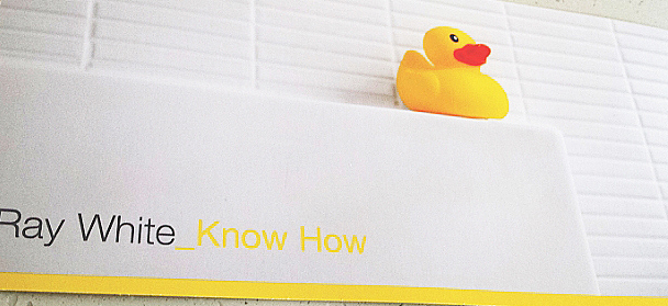
The rubber duck flyer
Oooh, ducky.
I’ve looked at this for a long time (OK, OK – I gave it a couple of minutes casual thought while waiting for the kettle to boil) and I still have no idea what the duck signifies.
It’s from a real estate agent so duck… bathroom… home… buy massively over-priced real estate… Nope, I thought I had it there for a moment but then it just slipped away like water off a duck’s… or whatever.
Still it made me look, so there.
Another bafflingly idiosyncratic touch is the yellow underscore _Know which suggests something vaguely hi-teccy, a computer program perhaps because we all know those things are used a lot in the arcane world of coding which means they must know what they are doing and be pretty shit-hot real_estate_agents. I’d let them talk me into anything.
But the duck, the duck… I dunno.
The Australia Day guide
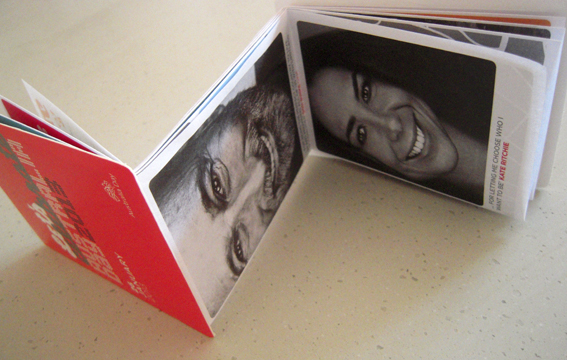
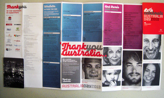
It’s Australia Day tomorrow so let’s celebrate with an unusual example of paper folding. This fold-out guide to Australia Day in Sydney 2013 was a freebie I picked up on the street. It measures only 11x8cm, including board cover, in its folded state but opens out to a double-sided 48 panel sheet. I’m not sure what the sheet size is – it’s an elongated A3 – an A3 plus two-thirds A4 stuck on the end. My guess is this sheet size is used to fit the machinery that makes it.
Anyway, the size is not so important as the fact that it all folds down into a neat little pocket-size item sandwiched between two celloglazed boards. People who love folding (yes, there are such people) will tell you that it is the fold that maketh the product; without a fold, all you have is a piece of paper. A fold is what creates a brochure, a newspaper, a book. This particular folded item even has its own name; it’s called a Z-Card, its branding backed up by copyright claims, trademarks and patents pending. According to its website, the Z-Card was invented in the UK 20 years ago and has now sold more than 1.5 billion items worldwide.
I like the compact nature of the Z-Card and the fact that so much information is included in such a small format. I love fold-outs; there’s something childishly exciting in seeing a small piece of paper expand ever bigger. Give me a map over a GPS any day. I realise the same information is also contained in a free app downloadable to any smart phone or tablet. It’s just that those words depress me slightly; folded paper makes me go ‘ooh’. And I reckon that duffers like me can find the info they need with a fold-out guide faster than it takes you to tap in your password. But that’s just me.
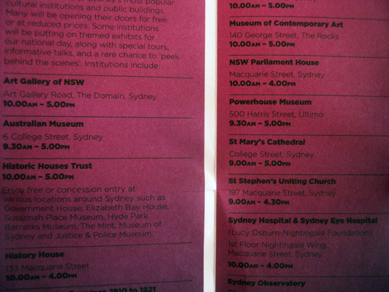
On the other hand, there are things I don’t like about this guide. Black type on dark red or purple is too much for my geriatric eyes. Maybe it looks good on screen, but in print, in tiny sans serif, well… it could be a bit more forgiving. Miscalculations like this don’t help the usability, which is what it is all about. Also the content is a bit light-on; about a third of it is taken up with acknowledgements of the sponsors and photos of celebs telling us why they like Australia. It’s like breakfast TV in print.
And, you know, there’s something just weird about opening it up and seeing Don Burke’s face in close-up beaming out at you. OK, so it’s as Australian as all get-out but perhaps it should carry a warning to avoid scaring small children and those of a nervous disposition. Happy Australia Day.
The AFL postcard
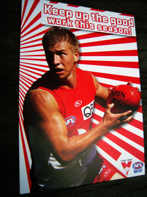
This chap lobbed into the post box yesterday, sent to my son who started playing AFL this year. It’s purportedly from Kieren Jack who plays for the Sydney Swans AFL team, with a little message of encouragement from him to ‘keep up the good work this year’, adding that ‘We hear you’re having a ball playing AFL and meeting new friends which is terrific’.
I like the blend of calculation and incongruity, the fact that on the one hand it is an obvious marketing ploy but, on the other, spookily perceptive. Having a ball playing AFL and meeting new friends? Well, yes, as it happens, that much is true and no doubt whoever wrote it – not Kieren obviously – had some research to back it up. Even so, it could have all gone horribly wrong as a message. In this case though, it hits the spot.
So I like that disjunction between the friendliness of the message and the fact the Kieren doesn’t know us from Adam. Getting the pitch right on these things is critical. They can easily come across as creepily cloying, over-friendly, but this one has just the right touch, doesn’t over-sell but keeps the focus on fun and being positive.
There’s a lot of work that’s gone into this production – the image and layout, the message, the printing, the database – all for one little postcard that is instantly disposable. It shows the extent to which the AFL will go to build bonds between its clubs and juniors, something which has been evident at the games this season too.
It takes effort and money to do this but, then again, it is big business; in 2010, the AFL made an operating profit of $10.6 million on revenues of $367 million.
Nicely printed too.
The hairdresser’s flyer
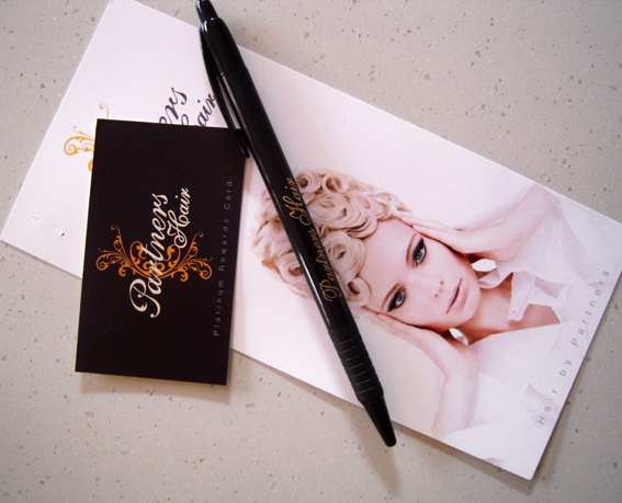
This example of a print promo certainly lifts the bar in terms of bling. It’s a three-part construction that appeared in my post box advertising a local hairdressing salon. There’s a DL-size double-sided flyer printed on 300gsm card, a business card size frequent buyer card and, best of all, a pen to fill it in! Somebody’s thinking.
The rewards card features the company name spelt out in silver foil, cursive script and everything. Dead classy. It’s remarkable that somebody is giving away offset print with foiling for free. With a pen. Don’t forget the pen.
It makes me almost sad to realise that I get my hair cut on a quarterly basis, paying $12 to Con the Barber. Such print is clearly wasted on me but I applaud the effort.
