Archives: Flyers

The rain-soaked flyer

Grocer's flyer

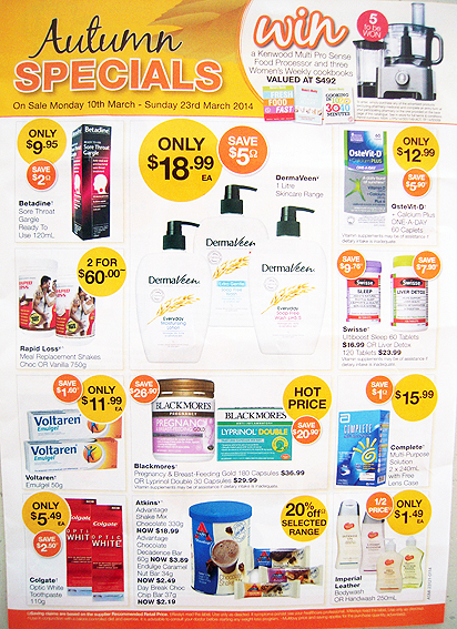
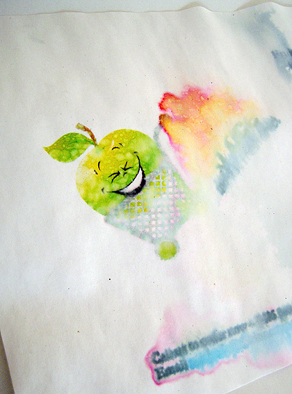
A spell of wet weather can be disastrous for an ill-timed letterbox drop campaign, as can be seen by this grocer’s flyer which arrived just in time for a sudden downpour.

Being safely cocooned inside the mailbox is no guarantee of making it to the recipient in good condition. This one was tucked away inside the box but still received a soaking which resulted in some rather weird things happening to the ink. Ummmm… runny.

Not that the cheery apple in the shopping cart here seems to mind all that much, although I doubt the advertiser was quite so pleased given that any contact details were blurred practically beyond comprehension.

This is the downside of print ‘n’ paper being tactile and organic and real and natural and all those lovely positive things that those nasty dead, cold, alien digital media channels are not. As a medium, print tends to respond to whatever environment it finds itself in – and if that’s a soggy one, well, the effects can be beautiful but rather unhelpful. Fire can also be awkward. Direct light, too, may cause fading in the long run while wind has a habit of redistributing printed matter according to its own particular whims.

In fact just about any interaction with the physical world will have an effect on print, which is why it’s better just to lock it away in a dark place where no-one can see it.

Equally though, there are times when the resilience of paper in the face of adverse weather conditions can be completely unexpected.

Perhaps it is this unpredictable and contrary nature of paper – fragile yet durable, disposable yet also archival – which makes it so beguiling to collectors and other papyrophiles.

shredded paper

The chemist’s flyer

Chemist letterbox drop

I see spots, lots of orange and yellow spots before my eyes. Do you have anything to treat that?

shredded paper

The ONE pop-up flyer

Pop-up ONE flyer

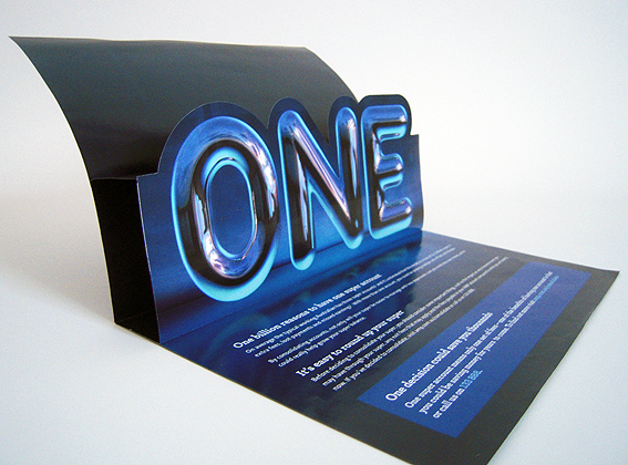
This one (or ‘ONE’) falls into the ‘interesting but meaningless’ category (as opposed to the overflowing ‘boring and meaningless’ category). It’s basically an A4 sheet with a fold and then, when you open it up, hey presto, there’s a big pop-up ONE. Why?*

The pop-up ‘ONE’ is another sheet which has been die-cut, folded and glued inside the main sheet so that it stands up on opening. It’s a basic piece of paper engineering which is, nevertheless, nice to see in a piece of marketing collateral. There should be more of it. The art of paper engineering is a much-neglected aspect of the whole print communication nexus (you see, I speak the lingo). Long before digital technology discovered the thrill of Augmented Realities, paper people were accomplished at making 3D environments.

Typically, pop-ups are associated with children’s books and, no doubt, many of us have fond memories, either from our own books or those of our children, of the excitement of turning the page and seeing a whole panorama spring to life. It’s pure magic – so why not use a little of it for the more mundane, grown-up topics of banking and superannuation?

I can’t help feeling though that, in this case, it could have been used for something rather more exciting that a big ONE. OK, so that is the message and, in order to make sure that we get it, I understand the rationale behind making it big, blue, shiny and STANDING UP. Fair enough. Sometimes though it would be nice if the message could beguile, charm or seduce, rather than just CLUB me into acknowledging it. Just a thought.

I figure there will be many long days before I see another pop-up flyer, so it’s just a little dispiriting that this should be the ONE.

* Why ONE? Apparently, it refers to the estimated $1.1 billion lost each year through misplaced superannuation accounts, although heaven knows how they arrive at such a figure. And it’s not even ONE. It’s ONE POINT ONE. Don’t they care about the other missing $100 million? How casual. I’m not giving them my super if that’s how relaxed they are about money.

shredded paper

The Coles flyer

Coles supermarket flyer

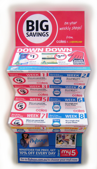
Quite by chance, I recently happened to be in the factory where they print this ordinary looking but deceptively complex 12-page Coles flyer. It’s an interesting process because while, on the surface, this looks like just another coupon booklet, the idea is that it should be possible for every recipient – and we’re talking millions here – to get a different set of offers.

Apparently, information gathered from shoppers’ buying habits and their loyalty program preferences will be used to personalise each mail-out so that every piece is unique and targeted to the recipient. In theory, this makes it statistically more likely that people will respond to the offers.

As the ribbon of paper unfolds, our desires are reflected back at us, a crude mirror image of who we are (I shop therefore I am) compiled byte by byte by huge data sieves that track and trace our daily needs.

This example, which came in the post just a few days after I’d seen where they were being produced, is not a particularly good example of the process. It lacks any specific, tailored marketing offers, as far as I can tell, which is probably due to the lack of information that has been collected about my shopping habits.

Nevertheless, it is still a pretty impressive production. It’s quite straightforward to personalise a printed document with names and addresses and numerical information – any mail merge will do that – but this document is attempting to do it in full colour at high speed (thousands of pages per minute) using quite complex marketing information, all printed double-sided in a single pass, sheeted, perforated, folded and ready to mail out – and it has to be 100 per cent accurate (I don’t want to receive offers for dog food or beauty products).

Meh, I hear you say. This is pretty much what we’ve come to expect in a digital world – clever machines that know exactly what we like, where we’ve been and who we’ve met. Everybody expects to be treated as an individual in Internetland – for goodness sakes, that’s where we live, that’s our identity! True enough, but it’s quite hard to translate all that detail and nuance into mass production; we may be all individuals but there very few things we buy or consume that are unique to us.

How to connect that personalised, digital world with the world of mass production and consumption is still a challenge. Coles has done it with a simple flyer; mass production, individualised item. Down, down, deeper and down.

I know, it doesn’t look like much but this is a truly remarkable document. Humans have been incapable of doing this until very recently; the technology required to print this way is younger than the iPhone or Twitter. This is cutting-edge, folks!

Certainly the people involved in its production are very excited by the possibilities. Will it work? We’ll see, but for the moment let us bask in the knowledge that, today, mankind is producing a more technologically-advanced strain of ephemera than has ever been seen before.

shredded paper

The greengrocer’s flyer*

Greengrocer's flyer

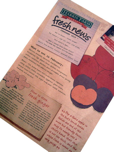
This flyer was stuffed into my shopping bag at the check-out recently. You can’t get much more direct than that – marketing collateral from the actual person who is taking my money. What next? The owner of the shop comes round and gives me a hand-written note?

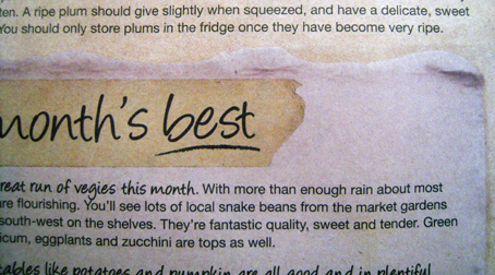
Actually, that is indeed the effect this piece aims to generate with all its elements of artfully-designed low-tech ‘manual’ communication – the pen-and-wash drawings, the Polaroid-style photo (interesting how the Polaroid is a marker of authenticity), the personal signature, the quotes (as if being spoken to by somebody), the script-like fonts.

I counted five elements that reproduce the effect of somebody writing on a piece of paper – in effect, five bits of paper stuck onto this one sheet, including one note on the reverse which looks as if it was written on masking tape and then attached to another note. So that’s a note on top of a note on top of the brown paper flyer. Another reversed-out type style mimics the effect of an instant label maker.

Greengrocer's flyer
Hand-written note on masking tape stuck to a piece of paper stuck to the flyer… layers within layers.

The whole piece is just begging to be clipped to a noticeboard or stuck on the fridge – which, of course, is the dream outcome for any direct marketing item: to be kept, to be valued, to offer on-going and continuing utility to the consumer beyond the immediate transaction – as every marketer must strive to achieve.

A quick word about the paper. Brown.

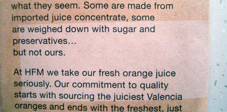
Natural, earthy, maybe even home-made/grown and organic as befitting a vegetable shop, unpretentious like the kraft paper used to make shopping bags. This sheet fairly crackles like a stiff carrier bag. And yet it is not uniformly brown; there is a lighter patch on the reverse which looks as if it has been bleached lighter, not over-printed. Is it a manufacturing defect? I don’t get it at all. Of all the elements on this sheet – and I haven’t even mentioned the actual content which is quite dense – it is this little pale patch which continues to mystify me.

Greengrocer's flyer
A mysterious lighter patch on the brown paper flyer.

* Yes, that’s right, this is not a ‘greengrocers’ apostrophe’.

shredded paper