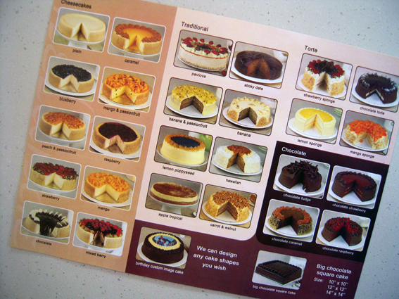
I think it was Bill Bryson or someone of that ilk who advised that one of the golden rules of travelling was never to eat at a restaurant where the menu comprised backlit photographs of the dishes on offer. It’s a rule I’ve broken many times, as anybody who has ever eaten in a food hall will appreciate, with mixed results along the way, some good, some bad.
I’m wondering though if the rule should be amended to include cake shops that advertise their wares by printing images of all their cakes. This flyer dropped out of the newspaper and immediately caught my eye, if perhaps not for the right reasons. OK, so I haven’t eaten any of these cakes. I’m sure they are delicious, light and fluffy, rich and sweet. But however good they may be in real life, the way they are presented here certainly does them no favours. The colours are drab and dull, the pictures lack any imagination or sense of style, the printing is flat and loose; there’s even the odd typo or two thrown in for good measure. In short, the whole thing looks completely unappetising from a print perspective, which is not a good start when the purpose of it is to sell food.
That’s why it caught my eye in the first place. We are so used to seeing fantastic direct mail pieces and catalogues that practically leap off the table with brilliant colours and dynamic design, great photography and amazingly vivid printing, so it comes as quite a shock to discover an item that fails on every level. I’m puzzled why somebody – the designer, the printer, the ad rep – didn’t stop the client at some point and say, ‘Hey, you know, this could be so much better…’
Mind you, there could be more to this than meets the eye. I’ve had this flyer on my desk for a while now and every so often I keep looking at it, trying to figure out what’s wrong with it (Let me count the ways…). It’s safe to say that no other flyer has occupied my time and attention to the same degree in recent times. So maybe there’s a devious reverse-psychology at work here, a deliberate ‘it’s so bad it’s good’ strategy that succeeds with failure. It’s brilliant when you think about it.
And, you know, I’m tempted to order one of these cakes just to see if they are anything like the photograph, to compare the taste with the marketing. Surely the reality can’t be as bad as the simulacrum (in contrast to most backlit menu meals where the reality often disappoints)? So let’s see, what shall it be… lemon poppyseed or mango & passionfruit…?


