Archives: Print

The Australia Day guide

Australia Day Z Card
Z by name, Z by nature – the Australia Day Z-Card.

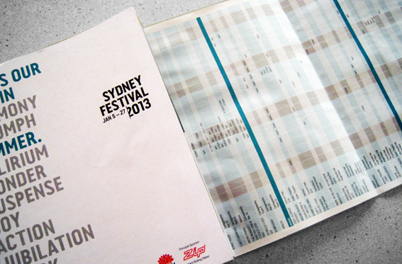
It’s Australia Day tomorrow so let’s celebrate with an unusual example of paper folding. This fold-out guide to Australia Day in Sydney 2013 was a freebie I picked up on the street. It measures only 11x8cm, including board cover, in its folded state but opens out to a double-sided 48 panel sheet. I’m not sure what the sheet size is – it’s an elongated A3 – an A3 plus two-thirds A4 stuck on the end. My guess is this sheet size is used to fit the machinery that makes it.

Australia Day Z Card

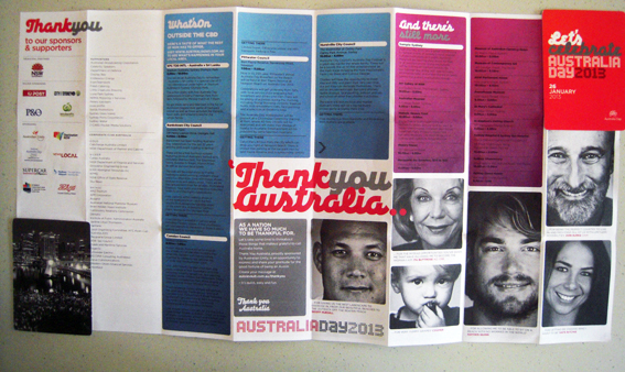
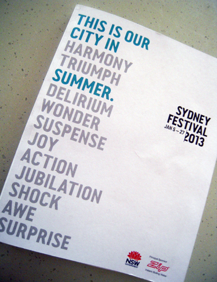
Anyway, the size is not so important as the fact that it all folds down into a neat little pocket-size item sandwiched between two celloglazed boards. People who love folding (yes, there are such people) will tell you that it is the fold that maketh the product; without a fold, all you have is a piece of paper. A fold is what creates a brochure, a newspaper, a book. This particular folded item even has its own name; it’s called a Z-Card, its branding backed up by copyright claims, trademarks and patents pending. According to its website, the Z-Card was invented in the UK 20 years ago and has now sold more than 1.5 billion items worldwide.

I like the compact nature of the Z-Card and the fact that so much information is included in such a small format. I love fold-outs; there’s something childishly exciting in seeing a small piece of paper expand ever bigger. Give me a map over a GPS any day. I realise the same information is also contained in a free app downloadable to any smart phone or tablet. It’s just that those words depress me slightly; folded paper makes me go ‘ooh’. And I reckon that duffers like me can find the info they need with a fold-out guide faster than it takes you to tap in your password. But that’s just me.

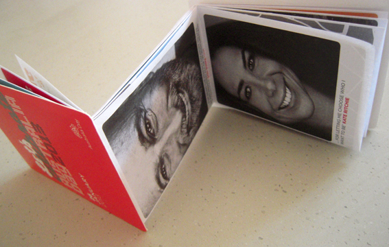
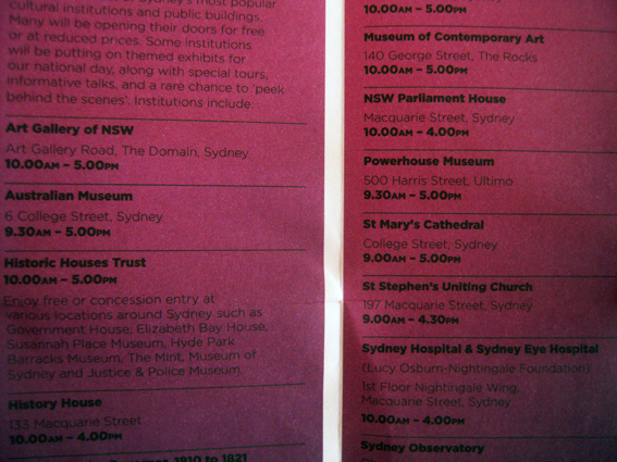
On the other hand, there are things I don’t like about this guide. Black type on dark red or purple is too much for my geriatric eyes. Maybe it looks good on screen, but in print, in tiny sans serif, well… it could be a bit more forgiving. Miscalculations like this don’t help the usability, which is what it is all about. Also the content is a bit light-on; about a third of it is taken up with acknowledgements of the sponsors and photos of celebs telling us why they like Australia. It’s like breakfast TV in print.

Australia Day Z card
Small text on dark backgrounds gives print a bad name.

And, you know, there’s something just weird about opening it up and seeing Don Burke’s face in close-up beaming out at you. OK, so it’s as Australian as all get-out but perhaps it should carry a warning to avoid scaring small children and those of a nervous disposition. Happy Australia Day.

shredded paper

The Sydney Festival booklet

Sydney Festival brochure

I picked up this booklet in the pub, I think, 136 pages with cover, roughly A5-size, perfect bound, printed by PMP Print in Sydney on uncoated stock. It’s got lots of solid black ink and small reversed-out type, quite impressive, given the speed at which it must have been printed. It’s even got a bound-in three-page fold-out at the back for a calendar of events; point size must be about 6 or 7, rather squinty for my tired eyes but very skilfully done. There’s a lot of information here in a tiny book and it looks attractive.

Sydney Festival booklet

The thing that struck me about it though, when I picked it up, was just how noisy it was. I think somebody must have spilt their beer on it and then it dried out, making the paper hard and crisp. Turning the pages produces a sound like ice breaking. In some parts the paper is so stiff, it’s hard to open the booklet at all without cracking the spine. At first I thought it might be a binding fault but it’s more likely to be because the pages have swollen, being drunk on ale. I hope so anyway.

Sydney festival brochure

It got me thinking though about the sound of print. Much is made about the sensory appeal of print over digital media – too much in my view – but it’s usually accepted that sound, along with taste, is not one of those sensory attractions. Why not? The swish of a page being turned. The rustle of the newspaper being folded. The clicking of pages being riffled. The thud of a book being closed. These are all distinctive sounds, unique to the activity of consuming printed material.

When culture is in the process of being consumed, it is mainly about the content: what’s the story, how does it make you feel, what does it all mean? When culture is looked at historically, however, it’s all about context – what was it like? The content of Shakespeare doesn’t change (well, not much) depending on whether it is performed at the RSC or the new Globe theatre but the experience is different; the latter tells us something about what it was like ‘in Shakespeare’s day’ ie what it was like to consume culture before history intervened.

The content of books doesn’t change in the shift from paper to digital production (for existing ones anyway – new ones are may be different) but the experience of consuming them is altered, and that means the culture changes as a result.  A group of sounds – familiar, evocative – disappears; a part of the aural culture fades out of earshot. The experience of opening a little book and hearing the pages crack will become as unique to me as readers of yore having to slice uncut pages (something I have only had to do once).

Perhaps, in years to come, when we are living in outer space and all information is automatically fed to our brains via digital implants, there will be museums or libraries with recordings of lost paper sounds so people experience what it was like to use real paper-based products (much in the same way that visitors to Jorvik can experience the sights, sounds and smells of a Viking settlement).

shredded paper

The NRMA brochure

The NRMA Review

An interesting publication arrived in the post from the NRMA. It’s a 32-page A4 landscape (appropriately enough given the cover and content) brochure which details the activities of the organisation over the previous year through the vehicle (sic) of stories from members and staff. It’s very nicely put together, lots of full-bleed photos and spreads, QR codes to link to the website and even a poignant introduction by Thomas Keneally who is pictured at North Head overlooking Sydney Harbour. You couldn’t get much more Aussie iconic.

I love the use of mini-narratives to highlight the work of the organisation – an acknowledgement of the power of story-telling to carry a message – and the photographs look great: just about everybody featured looks as if they’re having a laugh (apart from one teenage boy and a taciturn board member who keep it straight – hold it in boys). It’s been nicely printed on a quality coated stock by Offset Alpine although, for some reason, on my copy the cover has been trimmed a millimetre short top and bottom. No matter, it still looks fine.

It is exasperating then to see that the address sheet that accompanies the brochure is promoting a competition that encourages recipients to opt out of receiving the printed version of the review, ostensibly for the purposes of reducing the NRMA’s carbon footprint. This is ironic given the printed publication carries the PEFC logo for sustainably-managed forests (Note, sustainable – which means they are probably helping to reduce the amount of carbon dioxide in the atmosphere) and the ISO 14001 logo for environmental management. True, it doesn’t say that it is carbon neutral but I bet it would be possible and I’ve no doubt that a company such as Offset Alpine is working to reduce it’s carbon footprint and has already done so (Later: true, they closed down completely…).

Admittedly, the competition also offers the option for members to continue receiving the printed copy and there is no explicit link made between reducing carbon emissions and reducing print – although I would suggest that the link is heavily implied, perhaps misleadingly so. Is there any evidence that reducing the print run for this publication would cut carbon emissions or is it just another example of fuzzy group enviro-think: ‘Print is bad, therefore cutting print is good’? My guess is that it is more likely to be driven by budgetary concerns than any genuine desire to do something about climate change.

If you want to get a message out, to tell a story, then print as a medium has almost unrivalled cut-though, especially when it is done well, as in this case, with compelling content and attractive design. People will look at this publication, even if only briefly, and remember it. OK, so you could make it into a pdf and stick it on a server somewhere, maybe turn it into an interactive app, and I reckon that nobody would give a stuff. And it wouldn’t do much to save the environment either (where is the power coming from to run all those servers…?)

If something is worth telling, then it’s worth doing it in print. And if you do it well, don’t be embarrassed by it and undermine all that hard work by suggesting that it is somehow bad for the environment when it’s not.

shredded paper

The bottle shop catalogue

Wine catalogue

Another super-shiny catalogue arrived in the mailbox, this time from the local bottle shop. The UV varnish on the cover is so smooth I can see my face in it.

Why am I writing about this catalogue? That is the question. It is the question I was asking myself recently while speculating idly about the degree to which my interest in such ephemera is intellectual rather than emotional – what do I care about the catalogue? Nothing, of course. By it’s very nature, ephemera is transient and fleeting, no more substantial than the bow wave from a passing ship or a puff of smoke from a dying fire.

Pushing on, I can remark on the strange wondrousness of somebody wanting to produce this item and stick it in my letterbox, what this says about the nature of print in the early 21st century – reviled in many quarters as an environmental turd, ignored by perhaps far more, regarded by just about everybody as old, old, old. And yet, and yet… here is this thing. Nothing like this has been done before, or rather it has… but never so easily nor so abundantly and given away for free.

Wine catalogue

Wine catlogue text

Wine catalogue text

Look at the number of design elements on each page. Quite apart from the serried ranks of reds, whites and rosés, there are corners of concentrated design that combine a dozen different elements or more – text, reversed out text, reversed out raggedy text that picks up the background colour, curved text, text down to, say, four or five points and still readable, very subtle vignettes and shading, photos with borders, deep-etched with drop shadows, all printed in full colour on coated stock, folded and stapled.

Last week, the Americans landed the Curiosity rover on Mars. Fantastic, mind-boggling achievement, almost unbelievable, way out at the far extremes of what humans can do ie put something on another planet. Given the tiny amount of matter that has ever managed to break free of our blue orb, it shows remarkable skill and dexterity to do it so carefully and precisely.

I’m not foolish enough to compare Curiosity with a piece of junk mail. Actually I am. One may be wholly admirable and the other more often despised but both are almost beyond my comprehension. I can barely grasp the hours of endeavour, the mind-stretching use of technology, the creativity of purpose that went into producing both items – neither of which would have been possible just a few years ago.

So this is where we are at. From Mars to my mailbox, the mechanics of production and delivery are a baffling mystery. And yet I know what is possible. The gulf between what is possible and what is knowable seems to widen ever more.

But maybe that’s just me. Always a sucker for a bit of techno-rapture.

shredded paper

The Coles flyer

Coles supermarket flyer

Quite by chance, I recently happened to be in the factory where they print this ordinary looking but deceptively complex 12-page Coles flyer. It’s an interesting process because while, on the surface, this looks like just another coupon booklet, the idea is that it should be possible for every recipient – and we’re talking millions here – to get a different set of offers.

Apparently, information gathered from shoppers’ buying habits and their loyalty program preferences will be used to personalise each mail-out so that every piece is unique and targeted to the recipient. In theory, this makes it statistically more likely that people will respond to the offers.

As the ribbon of paper unfolds, our desires are reflected back at us, a crude mirror image of who we are (I shop therefore I am) compiled byte by byte by huge data sieves that track and trace our daily needs.

This example, which came in the post just a few days after I’d seen where they were being produced, is not a particularly good example of the process. It lacks any specific, tailored marketing offers, as far as I can tell, which is probably due to the lack of information that has been collected about my shopping habits.

Nevertheless, it is still a pretty impressive production. It’s quite straightforward to personalise a printed document with names and addresses and numerical information – any mail merge will do that – but this document is attempting to do it in full colour at high speed (thousands of pages per minute) using quite complex marketing information, all printed double-sided in a single pass, sheeted, perforated, folded and ready to mail out – and it has to be 100 per cent accurate (I don’t want to receive offers for dog food or beauty products).

Meh, I hear you say. This is pretty much what we’ve come to expect in a digital world – clever machines that know exactly what we like, where we’ve been and who we’ve met. Everybody expects to be treated as an individual in Internetland – for goodness sakes, that’s where we live, that’s our identity! True enough, but it’s quite hard to translate all that detail and nuance into mass production; we may be all individuals but there very few things we buy or consume that are unique to us.

How to connect that personalised, digital world with the world of mass production and consumption is still a challenge. Coles has done it with a simple flyer; mass production, individualised item. Down, down, deeper and down.

I know, it doesn’t look like much but this is a truly remarkable document. Humans have been incapable of doing this until very recently; the technology required to print this way is younger than the iPhone or Twitter. This is cutting-edge, folks!

Certainly the people involved in its production are very excited by the possibilities. Will it work? We’ll see, but for the moment let us bask in the knowledge that, today, mankind is producing a more technologically-advanced strain of ephemera than has ever been seen before.

shredded paper