Archives: Print

The linen brochure

Linen brochure

Everything I’ve read or heard about direct marketing emphasises the importance of having good quality data; if you don’t have accurate information about your target prospects then you’re simply firing off blindly, more in hope than any real expectation of striking sales success. At the very least, DM campaigns should aim to get the names and addresses of the recipients correct as nobody likes seeing their name misspelt; when it comes to making a good first impression with potential customers, not knowing what they are called is a big handicap.

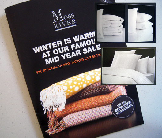
On that score, this brochure that came in the post from a linen retailer is a massive fail. I’m not sure how we ended up on their list nor when but, regardless, their marketing collateral keeps turning up, the name of the addressee hopelessly misspelt, not even close. Moreover, the fact that these items keep on arriving, regardless of whether or not we respond to them (ie there are no coupons or individual offers to track response rates) suggests the retailer has no way of determining whether or not the DM is actually working, or if it is, which parts are more successful than others.

But you know what? It doesn’t really matter. That’s because all the money and the effort has gone into producing the collateral. And it shows. It looks gorgeous; precisely sculptured pictures of pillows and doonas, all swooningly still and serene. It makes me feel sleepy just looking at it. Apart from a couple of pages of colour, most of it is in white, along with about fifty shades of grey, against a backdrop of the deepest pitch black (pretty impressive for what appears to be a digital print job).

I’m continually amazed that items such as this turn up in the mail box, unbidden, unpaid, seeking my attention; 16 pages in total, nice stock, beautifully printed, full bleed, stapled, great photography – all free.

People talk about how ‘print is dead’ but really this is a golden age of print; 10, 15 years ago, something like this simply wasn’t possible – or if it was, it would have been prohibitively expensive. Now they’re giving it away.

Some DM items tick all the right boxes, making sure the data is accurate, including some sort of response mechanism, maybe linking to a PURL, ensuring the offer is relevant and targeted to my needs etc (I don’t buy many beauty products, for instance, but can’t get enough wine offers) but, in the end, all this work is let down because the actual print item is crap – boring layout, dull photographs, written by the work experience kid and cheaply printed on shit stock.

The print still matters, even if it is instantly recycled and forgotten. Just assuming that it will be thrown out is a guarantee of failure. Creating something that people might actually want to look at from an aesthetic, not just a commercial, perspective is a good place to begin.

And yes, we do still go and buy our soft stuff from this store even though they don’t know who we are.

shredded paper

The dance festival brochure

Dance festival brochure

I experienced a slight pang of nostalgia when I received this brochure in the post a few weeks back. Ripping open the plastic bag it came in, I caught a brief, intense burst of scent, the aroma of offset print – heady, slightly metallic, redolent of whirring gears and spinning rollers, the careful, precise mixing of chemicals and pigments.

It made me wonder if, in the not-too-distant future, this will become a lost sensory experience, a forgotten phenomenon in the same way that people, by and large, no longer encounter the smell of wood fires on a cold winter’s evening, the fug of a passing steam train or the stench of horse shit on our streets.

Bloody good thing too, you might say; after all, who really wants to expose themselves to such things? We’re talking about pollution here. By any measure, the right to clean air is a fairly basic human requirement.

Well yes, that’s true – modern life is a never-ending narrative of social improvement – but then again nostalgia is the residue of loss; sharp, distinctive, often imprecise and puzzling. The fact is that the smell of print is something that will probably soon be lost to future generations, not entirely, not globally, but generally.

This is due not only to the on-going shift of massive amounts of printed material to an online, digital environment but also because the printing processes themselves are changing. The latest toner-based and inkjet ink technologies that are set to replace offset printing over the next decade or so are comparatively odourless. Even offset printing itself has abandoned many of the smellier, noxious chemicals of the past so that a visit to a modern printroom is no longer the intoxicating, eye-watering olfactory experience it once was.

I often hear printers talk about the advantages of print as a ‘tactile, sensory’ medium compared to online channels, as if our consumption of digital information takes place in a sterile, almost telepathic, environment. It’s not true of course. We use our sight for both media, and both books and tablets require touching. Indeed, it could be argued that the ‘swipe’ of a touchscreen is a more sensuously enjoyable feeling than the turning of a page (which, at risk of going off at a tangent, reminds me of this sketch about page-turning which still makes me laugh).

Digital media also often engages a sense which is neglected by print – at least once the reader is past the age of about four or five – by incorporating sound into the mix.

Neither media tastes very nice, not unless you are a habitual paper-eater.

When it comes to smell, however, print wins by a nose. I’ve tried sniffing my phone and I’m not getting much from it. In some instances, printers have tried to exploit this advantage by deliberately adding specific aromas to their printed products – the old scratch ‘n’ sniff. Perhaps if somebody had thought to make newspapers smell of chocolate then the likes of Fairfax and News Ltd wouldn’t be facing the challenges they do today. Either that or chocolate consumption would have gone through the roof.

So indulge in the full sensory enjoyment of ephemera such as this dance festival brochure – beautifully printed on heavy uncoated stock – while you can. Once it’s gone, we will not smell its like again.

shredded paper

The greengrocer’s flyer*

Greengrocer's flyer

This flyer was stuffed into my shopping bag at the check-out recently. You can’t get much more direct than that – marketing collateral from the actual person who is taking my money. What next? The owner of the shop comes round and gives me a hand-written note?

Actually, that is indeed the effect this piece aims to generate with all its elements of artfully-designed low-tech ‘manual’ communication – the pen-and-wash drawings, the Polaroid-style photo (interesting how the Polaroid is a marker of authenticity), the personal signature, the quotes (as if being spoken to by somebody), the script-like fonts.

I counted five elements that reproduce the effect of somebody writing on a piece of paper – in effect, five bits of paper stuck onto this one sheet, including one note on the reverse which looks as if it was written on masking tape and then attached to another note. So that’s a note on top of a note on top of the brown paper flyer. Another reversed-out type style mimics the effect of an instant label maker.

Greengrocer's flyer
Hand-written note on masking tape stuck to a piece of paper stuck to the flyer… layers within layers.

The whole piece is just begging to be clipped to a noticeboard or stuck on the fridge – which, of course, is the dream outcome for any direct marketing item: to be kept, to be valued, to offer on-going and continuing utility to the consumer beyond the immediate transaction – as every marketer must strive to achieve.

A quick word about the paper. Brown.

Natural, earthy, maybe even home-made/grown and organic as befitting a vegetable shop, unpretentious like the kraft paper used to make shopping bags. This sheet fairly crackles like a stiff carrier bag. And yet it is not uniformly brown; there is a lighter patch on the reverse which looks as if it has been bleached lighter, not over-printed. Is it a manufacturing defect? I don’t get it at all. Of all the elements on this sheet – and I haven’t even mentioned the actual content which is quite dense – it is this little pale patch which continues to mystify me.

Greengrocer's flyer
A mysterious lighter patch on the brown paper flyer.

* Yes, that’s right, this is not a ‘greengrocers’ apostrophe’.

shredded paper

The cake shop flyer

Cake shop flyer

I think it was Bill Bryson or someone of that ilk who advised that one of the golden rules of travelling was never to eat at a restaurant where the menu comprised backlit photographs of the dishes on offer. It’s a rule I’ve broken many times, as anybody who has ever eaten in a food hall will appreciate, with mixed results along the way, some good, some bad.

I’m wondering though if the rule should be amended to include cake shops that advertise their wares by printing images of all their cakes. This flyer dropped out of the newspaper and immediately caught my eye, if perhaps not for the right reasons. OK, so I haven’t eaten any of these cakes. I’m sure they are delicious, light and fluffy, rich and sweet. But however good they may be in real life, the way they are presented here certainly does them no favours. The colours are drab and dull, the pictures lack any imagination or sense of style, the printing is flat and loose; there’s even the odd typo or two thrown in for good measure. In short, the whole thing looks completely unappetising from a print perspective, which is not a good start when the purpose of it is to sell food.

That’s why it caught my eye in the first place. We are so used to seeing fantastic direct mail pieces and catalogues that practically leap off the table with brilliant colours and dynamic design, great photography and amazingly vivid printing, so it comes as quite a shock to discover an item that fails on every level. I’m puzzled why somebody – the designer, the printer, the ad rep – didn’t stop the client at some point and say, ‘Hey, you know, this could be so much better…’

Mind you, there could be more to this than meets the eye. I’ve had this flyer on my desk for a while now and every so often I keep looking at it, trying to figure out what’s wrong with it (Let me count the ways…). It’s safe to say that no other flyer has occupied my time and attention to the same degree in recent times. So maybe there’s a devious reverse-psychology at work here, a deliberate ‘it’s so bad it’s good’ strategy that succeeds with failure. It’s brilliant when you think about it.

And, you know, I’m tempted to order one of these cakes just to see if they are anything like the photograph, to compare the taste with the marketing. Surely the reality can’t be as bad as the simulacrum (in contrast to most backlit menu meals where the reality often disappoints)? So let’s see, what shall it be… lemon poppyseed or mango & passionfruit…?

shredded paper

The label expo booklet

Label exhibition brochure

This little A5-size booklet arrived from Europe a few weeks ago advertising an upcoming label show in Brussels. It’s a show, a ‘live’ show, so that explains the rock ‘n’ roll theme including copying the Rolling Stone masthead style, although I think they could have come up with a better title than Newsletter – that’s what it is, not the title. It’s like calling your magazine, Magazine – and no doubt someone has done that too.

OK. So where was I? Oh yes, the rock ‘n’ roll theme. It’s also used on the address sheet which features a cartoon version (calling it a ‘parody’ flatters it) of the Beatles Abbey Road cover except it looks more like Bon Jovi crossing the road and Abbey Road is now in Belgium because that’s the Atomium in the background. Then again, one of the band is carrying a double-neck guitar so maybe it’s meant to be Led Zeppelin and they are looking for a Stairway to Heaven. The white VW Beetle on the Abbey Road cover has become a Citroen 2CV while the black police van has turned into a yellow taxi. On the cover of the booklet, the T-shirt of the lead singer with his back to the crowd reads ‘Rock Your Labels Off’.

I get the rock ‘n’ roll thing but the Beatles-reincarnated-as-Led-Zeppelin-on-Abbey-Road-in-Brussels spin is just too confusing for Simple Minds like mine. Still, someone’s having fun.

shredded paper