Archives: Print

The White Pages

The White Pages

Today we hit the mother lode in terms of ephemera, the pièce de résistance, the archetype for all other ephemera – the White Pages directory (although strictly speaking, it’s not ephemera at all because it is a book). In terms of useless daily print though, this is the grand daddy of them all (they first appeared in 1880), perhaps the single main item of print that consumers have in mind when they describe print as being wasteful, harmful to the environment and generally unloved. Who can ignore the piles of unwanted Yellow and White pages lurking in alley ways or lying in the lobbies of apartment blocks? It’s not a good look, a toxic reminder that people don’t use print.

These days the general consensus seems to be that anything the White/Yellow pages can do, the internet can do better. The past decade or so has seen a dramatic drop-off in directory printing and most experts now agree that it is a declining sector, at least in developed economies. This decline is only likely to accelerate with the spread of mobile computing.

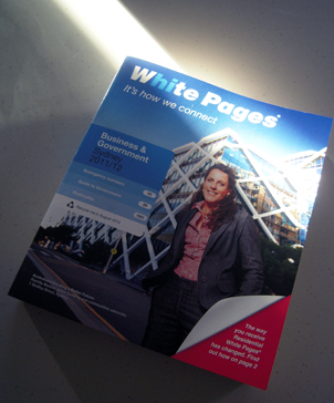
Sensis, the publishers of the White Pages, has acknowledged as much with the announcement that, as of this year, residential White Pages will no longer be delivered automatically to every household: if you want a copy, you’ll have to ring up and get one or collect it from the post office. This will see a reduction in the number of White Pages books printed from about 1.4 million to just a few hundred thousand (this particular example delivered to our door is the Business and Government White Pages).

At the same time, the White Pages itself is getting smaller; this edition is 3-3.5cm smaller all round, although it is the same thickness (it is just 8 pages shorter than the previous edition). That means the type has also shrunk to the point at which standard entries are now barely readable, even with my glasses on. Any business hoping to get noticed in the White Pages had better pimp their listing by investing in some bold type. Sensis also offers a free ‘pocket sized magnifying aid’ for anybody who now finds the listings too small to see. Alternatively they could just hop online.

No doubt the shrinking White Pages delivers a significant cost saving, given that paper is the most expensive consumable used in their production, but it is also indicative of the increasing irrelevance of such directories, an instinctive response which seems to say: “Perhaps if I get smaller then maybe people won’t hate me as much”. Sensis describes it as being easier ‘to handle and store’.

All of this tends to over-shadow the fact that the White Pages is a remarkable print production, 1,016 pages of tiny type printed on little better than tissue paper, bound and trimmed in perfect order. The registration on my copy is slightly out on the early colour pages but, all in all, it’s an amazing artefact given the speed and volume of its production. Those extraordinary colour maps of the entertainment venues – almost unreadable without a magnifying glass – are incredibly detailed, often using just a single row of dots to delineate features. That’s very precise printing.

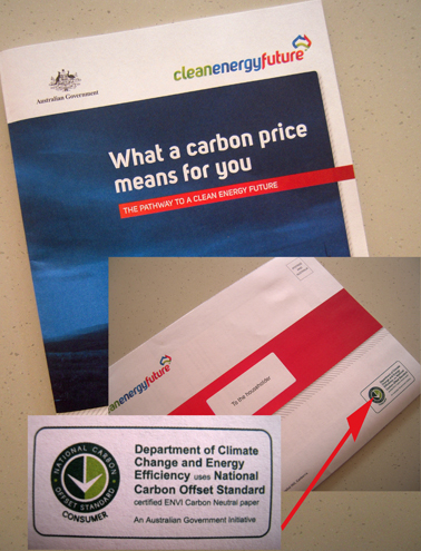
So what, you say, it’s still a waste of resources and harmful to the environment. Well, maybe, although Sensis itself is keen to point out that production of its books has been certified as being carbon neutral and the paper itself uses 40% recycled fibre. An awful lot of used and unwanted directories also get recycled, re-entering the production stream, or sit on bookcases as big, silent carbon sinks.

That’s not to say the White Pages doesn’t have an environmental impact – almost every human activity does, even online search – but at least its production is theoretically sustainable; almost every element that goes into the printing of the directories has the potential to be recycled or sourced from sustainable resources. The White Pages may look like a big waste of space but it’s not an environmental villain.

So what, you say, it still can’t compete with the speed and ease of an online search. Well, maybe, although – as a random example – I don’t know where, online, I would find the phone number of every single hospital, aged care centre, community health centre and early childhood centre in NSW, all on a couple of easy-to-read pages in alphabetical order. No doubt I could search for it and find it online (I did start searching the NSW Government Health site but after clicking away uselessly for a couple of minutes… hey, life’s too short); with the White Pages it took me 5 seconds to turn to ‘Health’.

True, the White Pages is not searchable in print form but that doesn’t mean that it isn’t often quicker for finding stuff than typing it into Google. My guess is that the reason why users prefer to search online is not that it is necessarily any quicker but because they are already sitting at their screens; consulting the White Pages actually means getting up and doing some heavy lifting. That’s indolence, not ease.

Besides, where else except in the White Pages would I be able to find out that the very first business in NSW, alphabetically-speaking at least, is A AAAAAAAAAAAAAAAAAAA Aardvark Finance Lenders. You can’t Google that.

shredded paper

The toast direct mail

No toast
A world without toast

No toast. Toast. No toast. Toast! Let’s try that again. Ready now…. No toast. Toast! It’s brilliant – direct mail advertising that works like a Play School game. No toast…. Toast!

The hardest part of direct mail is actually getting people to read the stuff. Getting it in the post box is easy; that just requires a bit of planning and some money. But how to get people to actually open and take note of your lovingly-crafted DM offer? The end bit is always rather hit and miss.

What if it arrives on the same day as a particularly nasty electricity bill (damn that new battery-powered car) or the news that, regrettably, your application to become a High Court judge has been refused? Not much chance then of getting in a sideways word about a great deal on duvet covers. Even if it arrives in the same post as an unexpected letter from your favourite aunt which includes a $50 note simply because you’re a wonderful person and she adores you, the chances are that any DM offer, no matter how brilliantly designed and wittily phrased, will appear rather small beer in comparison.

So what to do? This example resorts to a simple fort-da activity involving toast. On the front page, there is a picture of a toaster and an empty plate. This is the world without toast although, teasingly, there is the prospect of toast (mind you, I’m so dim that when I first looked at it, even with the presence of a toaster and an empty plate, I never for a moment suspected the imminent arrival of toast. How dumb is that?). Open up the fold and there’s the toast, flying into the sky at great speed, presumably coming back down to earth to land on the still-empty plate. That’s the world with toast. See? No toast. Toast!

Toast!
A world with toast.

Obviously, the idea of the DM piece is to get us to recognise the benefits of living in a world with toast. The tagline on the front page invites us to ‘Wake up to a great rate every day’ and then suggests this is something to do with having toast pop out of the toaster every morning, although, quite frankly, if my toaster behaved like that every day, strewing crumbs around the kitchen, then it would quickly find itself on a one-way trip to the back lane.

Apart from that, there’s another problem I foresee. Now I like toast. I do. I had some toast this morning. But every day? Hmmm, I’m not sure about that one. I think I could quickly tire of toast and, hence, of living in a world with toast. How about a world of muesli? If I have to wake up to something every day (and, let’s face it, I really should) then I’d rather it was the sun shining, the lack of a hangover and the sweet recollection of a dream in which I am awarded the Nobel Prize for Beach Fishing.

More confusingly, if you open up the complete brochure, what you see inside is a picture of a self-satisfied man reading the racing form or the financials who appears to be EATING MUFFINS. How wrong is that? What happened to the world with toast we were promised? And why can’t we have what he’s having?

So you see, designing these direct mail pieces is fraught with danger and should only ever be attempted by highly-skilled practitioners.

shredded paper

The government brochure

Government brochure

I couldn’t let this piece of Federally-funded ephemera pass by unnoticed. It is, as anybody who has been paying attention knows, the Government’s 20-page brochure outlining its plans to introduce a price on carbon pollution and what it intends to do with the money. It’s full of information. And ● bullet points. And break-out boxes for ease of reading. As you might expect, the colour green features regularly and prominently.

It’s amazingly well-printed on uncoated stock by PMP Print in Melbourne. The pics have neat little drop shadows. The clouds in the sky are light and airy. The bare branches of the tree are stark and woody. They really should get a prize for doing that. It’s glued rather than stitched, which is unusual.

Anyway, all that is by-the-by because the thing that really caught my eye is the little logo on the back page announcing that it was printed on ENVI, a special paper produced by Australian Paper that has been certified carbon neutral under the Australian National Carbon Offset Standard (NCOS). No surprises, I guess, that, in this instance, the Department of Climate Change and Energy Efficiency decided to use a paper that has been certified carbon neutral by its own standard. What choice did they have? The word is that the government paid about 10% more for the paper.

Mind you, ENVI is not without its critics and Australian Paper has been in the news recently for its continued use of native forestry timber which threatens its Forest Stewardship Council (FSC) accreditation.

The road to sustainability is paved with good intentions, half-truths and contradictions. In this case, the DoCC obviously thought it was doing the right thing by choosing a carbon neutral paper for their brochure, but what it also does is draw attention to the fact that the paper and its manufacturer have been accused of ‘greenwashing’ and destroying native forest – which is perhaps not the best way to kick start a new scheme designed to combat carbon pollution.

So, on the one hand, the government gets a tick for using a paper that offsets the carbon produced during its manufacture and from a company which has accreditation for responsible forestry management from a world authority on the subject (although it seems to be having second thoughts). On the other hand (you can tell I’m being even-handed here), all such logos, ticks and approvals are just window dressing used to obfuscate and confuse consumers about the realities of paper manufacturing as a wasteful, dirty, destructive industry.

I’m on the side of paper here, even though it’s not perfect, because:

  • I like it
  • I’ve always used it (although I can change)
  • I believe that paper production can be sustainable using renewable, reusable resources with a manageable environmental impact (OK, so this may be based more on hope than history, but we can all change)
  • I don’t think other media are much better despite the widespread belief that online communication helps to ‘save’ the environment. Computers? Sustainable? Pfft.
  • Paper is easy to use, low-tech, cheap, accessible, democratic, ubiquitous and it works – it is very good at communicating messages (a means to an end).

Carbon offsets are not perfect, FSC accreditation is not perfect by any means, but they are attempts to address serious problems in an imperfect world. In the long run, it’s probably better to print a brochure such as this using ENVI than not to print it at all. It could be better but it’s better than nothing.

shredded paper

The AFL postcard

Kieran Jack postcard

This chap lobbed into the post box yesterday, sent to my son who started playing AFL this year. It’s purportedly from Kieren Jack who plays for the Sydney Swans AFL team, with a little message of encouragement from him to ‘keep up the good work this year’, adding that ‘We hear you’re having a ball playing AFL and meeting new friends which is terrific’.

I like the blend of calculation and incongruity, the fact that on the one hand it is an obvious marketing ploy but, on the other, spookily perceptive. Having a ball playing AFL and meeting new friends? Well, yes, as it happens, that much is true and no doubt whoever wrote it – not Kieren obviously – had some research to back it up. Even so, it could have all gone horribly wrong as a message. In this case though, it hits the spot.

So I like that disjunction between the friendliness of the message and the fact the Kieren doesn’t know us from Adam. Getting the pitch right on these things is critical. They can easily come across as creepily cloying, over-friendly, but this one has just the right touch, doesn’t over-sell but keeps the focus on fun and being positive.

There’s a lot of work that’s gone into this production – the image and layout, the message, the printing, the database – all for one little postcard that is instantly disposable. It shows the extent to which the AFL will go to build bonds between its clubs and juniors, something which has been evident at the games this season too.

It takes effort and money to do this but, then again, it is big business; in 2010, the AFL made an operating profit of $10.6 million on revenues of $367 million.

Nicely printed too.

shredded paper

The Qantas booklet

Qantas booklet

This little item from Qantas survived a couple of days in the letter box during the recent heavy rain and emerged with just a few damp patches. Impressive. I don’t know what they use to make this paper stuff but it sure is tough. (Just kidding – of course I know what goes into paper: the silent screams of Sumatran tigers and the soft exhalations of sad-eyed Orang-utans).

The marketing message itself is a soggy lettuce leaf of an idea that looks limp on the first page and then, embarrassingly, has to keep going for another 10 pages or so. It’s so weak it makes the Terms & Conditions page look interesting. No doubt it made a good pitch at the monthly S&M meeting but it’s only really speaking to those same people who think that what they’re selling is cool. Sometimes marketing departments just need to sit up and take a look at the world around them.

Anyway, it got me thinking about the colour red. Specifically the Qantas red. What a red it is, a true-blue Aussie red, appearing on everything from rugby shirts to credit cards, not forgetting the oceans of it applied to the tail fins of large aeroplanes. It’s a red that speaks to the heart of a nation of travellers, summoning up images of sunsets over the outback, the red dirt beneath our feet. How many Australians in distant lands have felt a tug on their heart strings when, noses pressed against the departure lounge window, they catch a first glimpse of Qantas red on the plane that will carry them safely home? I don’t know the exact figure but I imagine it’s a lot.

Such a powerful red deserves its own brand name (I’m calling it Q-Red) and that special reverence reserved only for the most iconic marketing concepts. I wonder how many man-hours went into developing Q-Red, subtly adjusting the shade and hue to arrive at the exactly the right effect. I imagine Don Draper himself mixed the colours while dragging on a Lucky Stripe and sipping his third lunch-time Martini. It must be one of the most jealously-guarded branding formulas in marketing, like Cadbury purple or Q-Red’s distant relation, Coca Cola red.

How deflating then to discover that Q-Red doesn’t look all that special after all. Judging by the mis-registration on this booklet, Q-Red is Simply Red, a mix of 100% magenta and yellow. That’s it. Red.  A primary colour. Something so basic it excites only a third of our colour receptors. How simple is that? And what lazy marketing. I’m outraged that one of our national brand colours is nothing more than ordinary red. How typically Australian too.

“What colour do you want to use to define your national carrier?”

“Aw, red’ll do. She’ll be right.”

From now on, I’ll never look at Qantas red – I’m too embarrassed to call it Q-Red any longer – in the same way. As far as I’m concerned, it’s just red and that’s all I’m seeing.

shredded paper