Archives: Print

The tourism brochure

Tourism brochure

Today’s ephemera fell out of one of the newspapers – it’s a 16 A4-page glossy heatset brochure, trimmed and stitched, promoting Canberra tourism. It’s quite a substantial piece of work, lots of colour photographs and full bleeds, remarkable really that 16 pages of shiny bright ink on glossy paper should be given away for free, just like that. Obviously somebody thinks there is value in doing so.

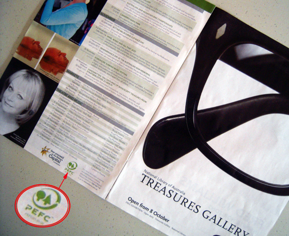
The bit that caught my eye was the little green PEFC (Programme for the Endorsement of Forest Certification) logo that appears towards the back. This tells us that the brochure was printed on paper sourced from forests that meet the requirements of the PEFC for sustainability, and that it was printed in Sydney by Offset Alpine. The little number underneath the logo – 21-31-05 – is exclusive to Offset Alpine as part of its membership of the PEFC scheme. Other printers and paper suppliers have different numbers.

All well and good but I wonder sometimes about the value of putting these blobby green logos on printed material. Who is this for? Not the readers, most of whom would have no idea what the logo means and what PEFC stands for, and presumably not the client who must already know or have specified the PEFC-approved paper. Perhaps it’s to remind them of their green credentials, in case they forget.

Sure, let’s spread the message about the sustainability of print – it’s a good story – but this type of enviro-branding doesn’t cut it for me. What’s wrong with saying ‘Printed by Offset Alpine on paper from sustainably-managed forests approved by PEFC’, or some such thing? OK, so it’s a bit long-winded but at least it says something. But then, hey, what do I know about branding? [Please feel free to reply ‘SFA’ below]

shredded paper

The wine club direct mail

Wine club brochure

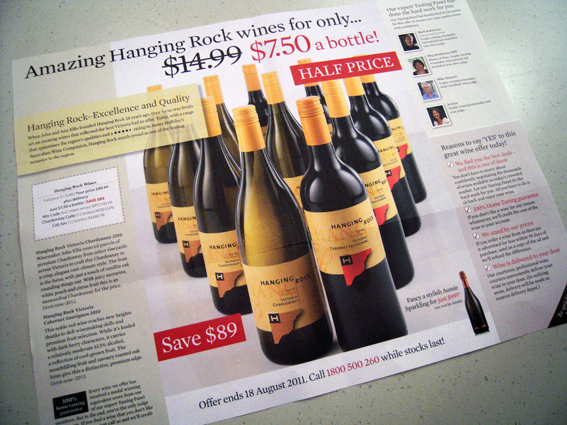
I love the mailings I get from the wine club. I received one recently that was really well-written, just the right pitch, not too serious and definitely not the usual marketing guff. That takes skill, and it worked for me. They even included a $50 voucher so naturally I spent it plus some more. It just goes to show that while everybody goes on about the importance of having accurate data in DM pieces, content and a good offer will win out every time. I don’t care if they spell my name incorrectly (which they don’t) if the deal is right.

Anyway, this is the latest one – uncoated stock which I like and the heady bouquet of offset ink – vintage stuff. It’s a generous glass-full as well on a sheet measuring 320x420mm which, as far as I can tell, doesn’t match any standard formats. It’s quite nice to see something which is not bog-standard A4. Very giving. An amazing print production really for the purposes of selling plonk.

Personalisation is minimal – they use my first name which is about it – but, as mentioned, that’s not the attraction. They know how much wine I drink too, which is a secret best kept between the two of us, and the fact that I like it cheap. Will I buy any more? Maybe, if only to ensure I keep getting the mail-outs.

shredded paper

The hairdresser’s flyer

Hairdressing salon DM

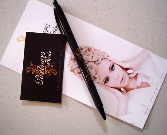
This example of a print promo certainly lifts the bar in terms of bling. It’s a three-part construction that appeared in my post box advertising a local hairdressing salon. There’s a DL-size double-sided flyer printed on 300gsm card, a business card size frequent buyer card and, best of all, a pen to fill it in! Somebody’s thinking.

The rewards card features the company name spelt out in silver foil, cursive script and everything. Dead classy. It’s remarkable that somebody is giving away offset print with foiling for free. With a pen. Don’t forget the pen.

It makes me almost sad to realise that I get my hair cut on a quarterly basis, paying $12 to Con the Barber. Such print is clearly wasted on me but I applaud the effort.

shredded paper