Archives: Print

The hotel booking door hanger

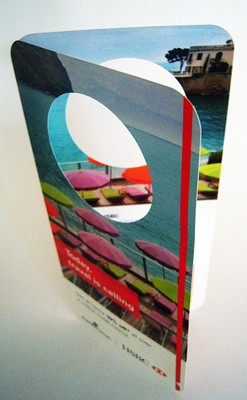
Hotel bookings hanger

Ha, well would you believe it?

Having mentioned previously how rare door hangers have become recently, it was perhaps inevitable that another would turn up soon afterwards.

This one comes from a bank in association with an online travel company to promote discounted hotel rooms. At least the connection is more obvious here – hotel rooms – do not disturb – please make up my room etc – so using a door hanger as a piece of direct mail makes more sense here even though it will probably never be used as a door hanger. Nor for any other purpose, for that matter.

It’s not hard to create a door hanger – just a simple die-cut and, in this case, a fold too – but, you know, if you’re going to do it then perhaps it might be fun to make something of it, be a little creative in terms of playing with the fact that it is a door hanger and it’s promoting hotels and, gee, wouldn’t it be nice to go to a fab hotel, kick back, raid the bar fridge, hang up the Do Not Disturb notice – and get 10% OFF AT THE SAME TIME.

Or don’t. Instead just create a door hanger and simply ignore the fact that it is a door hanger, leaving it up to the poor old punter to make the connection between door hangers and hotels because they’re really good at doing that sort of stuff.

Yeah, that’ll work.

shredded paper

The Woolworths coupons

Woolworths coupons

This is the counterpart to the Coles flyer that I gushed about so embarrassingly a couple of years ago.

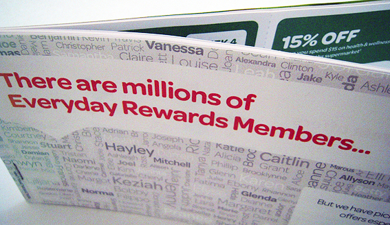
The main difference between the Coles and Woolies offerings is that whereas the former was a single folded sheet, this one comprises DL-size pages stapled together as a booklet. Also the Coles one was printed by a high-speed inkjet machine whereas this one looks more toner-based which, to my eyes at least, smacks a little bit of ‘Let’s just use the office photocopier…’.

The other noticeable difference is that Woolies make more of the fact that the coupons are personalised and in fact draw attention to the manner in which the offers are personalised via use of the customer’s name.

So, for example, the cover is made up of many different names which then serves to highlight the insertion of the recipient’s name printed in the same font and colour as the main head. The name is then reproduced on each coupon.

But, as in real-life interactions, to what extent does the frequent use of a person’s first name make it seem more personal or just a little creepy?

Print personalisation is a complex process and its effectiveness is usually dependent on the quality of the data held about the customer and their buying habits. Sometimes it is done well, sometimes it doesn’t matter if it is wrong, and then there are those cringeworthy attempts which are best forgotten about.

If you are going to highlight the process of personalisation, i.e. by putting it on the front cover, simply bunging in someone’s name every so often isn’t going to impress. Instead of making the recipient feel valued and appreciated, it actually comes across as more impersonal. ‘These exclusive offers especially for you [INSERT NAME]’ is merely a reminder that, as far as big corporations are concerned, your existence amounts to little more than bits and bytes in a distant mainframe.

shredded paper

The car insurance direct mail

car flyer 1

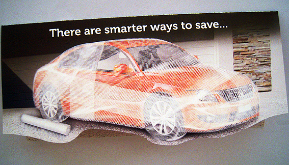
This is another of those ‘open up and look inside’ direct mail items that seek to tap into our childhood memories of lifting up flaps to discover what lies beneath.

In this case there is a car swathed in bubble wrap, presumably to keep it protected, but then if you open it up…

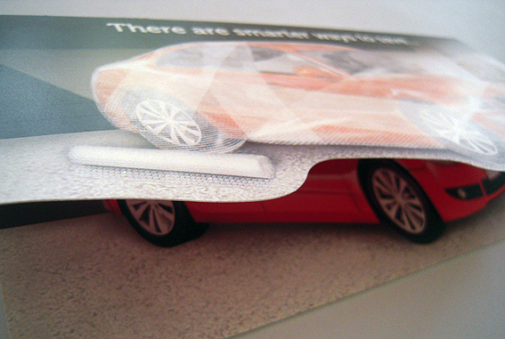
car flyer 2

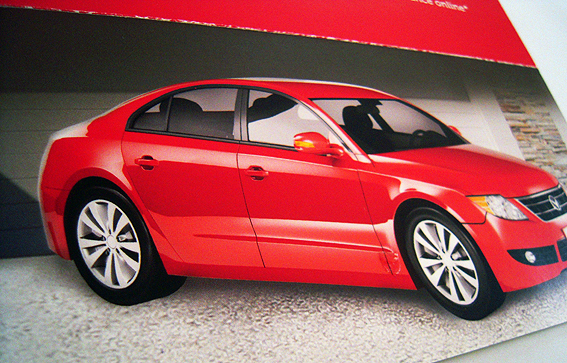
…there is a shiny red car sans bubble wrap which represents a smarter way to save on car insurance premiums.

car flyer 3

OK. Yeah. Um. Look, I get it. The thing is, I probably wouldn’t cover my car in bubble wrap to begin with (it makes driving it very awkward) so to some extent this is a solution to a non-problem.

Besides, without wanting to sound too pedantic about it, I don’t see how the whole bubble wrap thing is supposed to save money. Do insurance companies offer discounts for drivers who opt for comprehensive bubble wrap protection? And if it doesn’t save money then why do it?

Maybe you’re doing it for other non-monetary reasons, such as the fact that you happen to like bubble wrap and have a whole heap of it lying around ready to drape across your car. In which case, saving money is not really a consideration, is it?

In short, the insurance on offer here appears to be a smarter way to save simply because wrapping your car in bubble wrap is an incredibly dumb thing to do which won’t save you any money anyway. That’s not saying much, is it? It’s not particularly persuasive.

Anyway, who am I to say? These things are put together by people with stacks of experience and degrees in psychology to back it up so they probably know what they’re doing. We should just leave them to get on with it.

Perhaps if it had been a real car wrapped in bubble wrap and not just some dodgy Photoshop job then that might just perhaps have made it more interesting, less half-arsed. Worth looking at anyway.

shredded paper

The kitchen catalogue

The kitchen catalogue

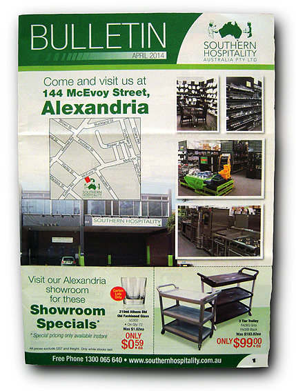
The darndest things turn up in the letterbox sometimes. Such as this 16-page catalogue of equipment and consumables for catering businesses. They are industrial supplies, which is surprising given that, in all my culinary endeavours, I rarely have need for a twin deck pizza oven or a sous vide bath (unstirred – whatever that means).

That’s not to say the catalogue is without interest, even for someone whose basic requirements extend no further than a saucepan and a can opener.

The kitchen catalogue detail

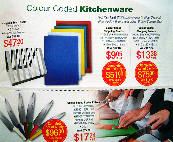
For instance, I never knew that knives and chopping boards could be colour-coded according to what they are used to chop. How do chefs manage to remember such details in the hurly-burly of kitchen prep? In fact it’s quite easy and logical: red for meat, white for dairy, blue for seafood (the sea, see?), yellow for poultry (what a yolk), green for veggies and brown for cooked meat (well-done presumably). Neat eh, although I’m not sure where tofu fits into this scheme.

The kitchen catalogue detail

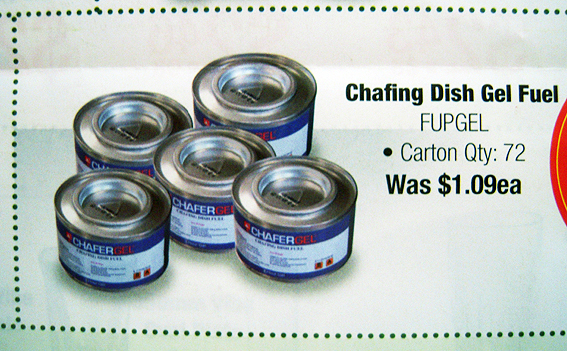
Then there’s the chafing dish fuel. I had no idea what a chafing dish might be, apart from perhaps being something that might involve constant rubbing. And why would it need fuel to do that? But it turns out that chafing dishes have a long and venerable history. Who knew? From such nuggets of knowledge are crossword clues born (and solved).

The kitchen catalogue

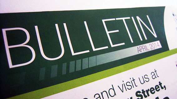
I’m still not enthusiastic though about publications being named after what they are – in this case Bulletin – rather than what they are about. It just seems like laziness to me, a lack of seriousness and effort to come up with a suitably descriptive moniker. All it takes is half an hour’s brainstorming down the pub. How about The Cater-logue? Kitchen Chronicle? Hospitality Herald? Anything would be more memorable than just Bulletin surely?

shredded paper

The colour chart direct mail

Colour chart

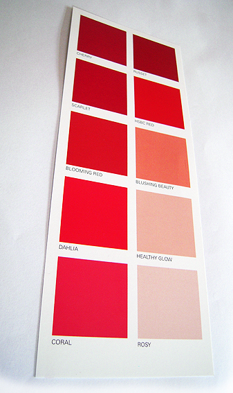
This one is quite neat because it’s not what you might think it is at first glance. It looks like a paint colour selector – because it’s meant to – but in fact it’s a direct mail piece from a bank advertising its home loan. The giveaway is that fact that one of the reds is the corporate colours of the bank, while all the other reds have fairly banal reddish names such as Cherry, Rosy, Scarlet, the likes of which would never be used on a real colour chart.

Also, on the reverse side, it tells you that it’s from a bank.

The piece is being used to sell the bank’s limited time special interest rate offer, along the lines of while the painting can wait, locking in your home loan etc… OK, so it’s not earth-shattering but I haven’t seen it before.

There are lots of ways in which potential customers might be urged to act quickly – racing for a finishing line, getting in before the doors close – so I like the subtlety of a simple DL-size piece that gets its message across using only shades of red.

I’ve written about ‘red’ as a corporate colour previously but, in this case it does appear that the red is a special – PMS 1795. It’s interesting to see a corporate colour scheme being used in this way, as part of an actual marketing message, when typically the identity police frown on it being used for anything other than branding purposes.

So hats off then for coming up with a clever concept for a direct marketing item, something which is all too easy to get wrong. Plus, if you wanted, you could always use it to select a paint colour for that feature wall…

shredded paper