Archives: Print

The rubber duck flyer

Real estate mailer

Oooh, ducky.

I’ve looked at this for a long time (OK, OK – I gave it a couple of minutes casual thought while waiting for the kettle to boil) and I still have no idea what the duck signifies.

It’s from a real estate agent so duck… bathroom… home… buy massively over-priced real estate… Nope, I thought I had it there for a moment but then it just slipped away like water off a duck’s… or whatever.

Still it made me look, so there.

Another bafflingly idiosyncratic touch is the yellow underscore _Know which suggests something vaguely hi-teccy, a computer program perhaps because we all know those things are used a lot in the arcane world of coding which means they must know what they are doing and be pretty shit-hot real_estate_agents. I’d let them talk me into anything.

But the duck, the duck… I dunno.

shredded paper

The fake certificate

The fake certificate

There’s a bank handing out fake Life Membership certificates to its customers, a conceit so confusing and poorly executed it makes me want to hand them a great big trophy for the ‘Worst Direct Mail of the Year’. A bit of foiling and embossing can’t disguise what a crock this is.

OK, so it’s just a bit of a laff, a cheesy attempt by a bank to say something nice to its customers, which is not easy when you’re busy out-sourcing operations overseas while making billion dollar profits off poor saps who don’t know what they’ve signed up for. Perhaps that explains why this example is so cack-handed. It takes practice to be friendly in a genuinely human-to-human way. Instead the bank has resorted to forced fakery, taking a punt that the customer will receive the communication in the right spirit, a hope based on nothing more than guesswork and a deluded belief in the hilarity of its own marketing.

Putting the goofiness aside, let’s just look at it seriously for a moment on its own terms, because a lot of money has been spent on creating this fakery and sending it out. It must mean something, must have something to say for itself.

So, as far as I understand it, this is a certificate sent to the recipient – let’s pretend the blurred bit says Harry Knobbleknees – to inform Harry Knobbleknees that he has been granted life membership of the Harry Knobbleknees Appreciation Society by the bank. It’s said to be a “symbolic” membership and has been granted “in honour of your special character”.

Some questions readily spring to mind, most pressingly as to why Harry Knobbleknees would want to be a member of his own Appreciation Society? Isn’t that just a trifle narcissistic? Who formed this society anyway and why has it been left to the bank to hand out memberships? How many other members are there? Is it just Harry Knobbleknees and the bank? How sad is that.

What the hell is a “symbolic membership” anyway? Presumably it gives Harry Knobbleknees symbolic entry to the Society’s symbolic meeting room and a symbolic vote at the AGM. For life.

And why is Harry Knobbleknees being given life membership of his own appreciation society in recognition of his “banking relationship” with the said bank? Does that mean he would be denied membership if he didn’t have such a relationship? That’s a bit cruel. Just who the hell put the bank in charge anyway? I bet Harry Knobbleknees didn’t vote for them.

Also, how come the bank is so sure that Harry Knobbleknees has a “special” character? Are they spying on him? For all they know, he might be very ordinary indeed. And proud of it. And if they don’t know, does that mean the bank is lying when it says it is honouring his character? Would you give your money to a bank that tells lies?

Perhaps instead of running the Harry Knobbleknees Appreciation Society, the bank should just get on with doing bank-like things. You know, like making sure there are enough tellers in the bank so that Harry Knobbleknees doesn’t have to queue up every time he visits the bank, or making sure that drug cartels aren’t shovelling billions of dollars through their accounts without anybody noticing.

It is hard to get people to take notice of direct mail. It can be very irritating. But there’s no point in getting customers to look at stuff if the message is muddled or meaningless; save the money and spend it on something that they might really appreciate, like better customer service.

shredded paper

The personalisation catalogue

Identity Direct catalogues

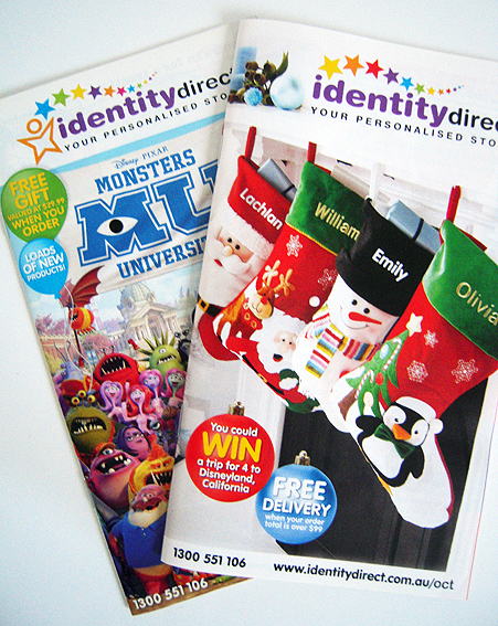
It’s not so much the paper objects here that are of interest – although the catalogues themselves are perfectly fine examples of the form – but rather what they are selling that catches the eye. This is print personalisation run riot.

There’s been a lot written in recent years about the confluence of digital technology and print, and how this offers the potential for new markets based on one-to-one communication. In some respects, none of this is new; a bill is a one-to-one communication, albeit not a very personal one.

The main change though has been the development of faster, higher quality and full colour digital presses capable of printing every single copy differently. Instead of the old print model whereby, typically, hundreds or thousands – maybe millions – of copies would be printed and everybody got the same thing whether they wanted it or not, the new model (the paradigm if you wish) is predicated on the idea that everybody only gets print that is tailored specifically to their tastes and preferences.

I’ve written about it before in relation to this Coles flyer, for instance.

Typically, personalisation is discussed in terms of marketing collateral and corporate communications, developing printed material that is more targeted that a simple ‘Dear [insert name]’. The idea is that the more personalised the communication is, the more successful it will be in actually conveying its message and triggering the appropriate response.

That’s not what this personalised print is all about. In fact, in the eyes of many commercial printers, I doubt if it would even be regarded as print (most of it is not on paper at all). But it is, and it’s amazing.

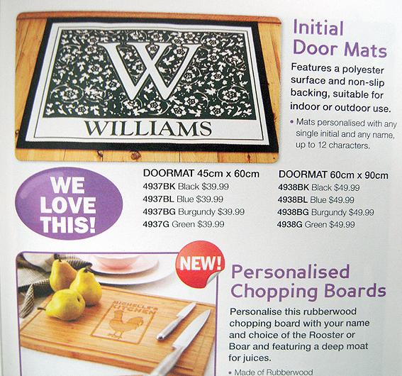
The Identity Direct premise seems to be that there is virtually no object in the world that cannot be improved by the simple addition of a person’s name. Some of these items are fairly standard, such as engraved pendants and key rings, but beyond that the personalisation spreads much further – into the kitchen (personalised chopping boards), the dining room (personalised place mats), the bathroom (personalised toiletry bags), down the hallway (personalised doormats) and into the backyard (personalised barbecue tools).

Identity direct catalogue

Then, of course, there are the myriad combinations of labels and stickers suitable for plastering over everything from top (hats) to bottom (shoes). The typical school challenge to ‘Please make sure everything is labelled’ is here met with gusto.

I imagine that living in an Identity Direct household must feel like a constant affirmation of one’s existence, a narcissist’s dreamworld. Christmas, in particular, is a very special time of year (for you, you, you and you) with its own personalised Christmas tree skirt, Santa cushions and tree baubles.

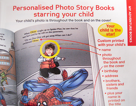
Interestingly, perhaps the only items that a conventional printer might recognise as ‘proper print’ are the personalised story books. Here, the personalisation takes the form of a typical data merge whereby standard information such as name, birthday and address is inserted into the text at the appropriate point. There’s even a photo book option using the image of a face.

Identity Direct catalogue

This is print very much of its time: not the mass communication tool of old which derived its strength from the fact that it enabled lots of people to read the same thing at the same time, but rather print for the i-society, a culture based on the primacy of the individual in which personal identity is everything. It’s not enough just to read a book now; you actually have to be in it.

shredded paper

The Yellow Pages tree

Yellow Pages tree

What to do with old Yellow Pages (or even new ones…)? This year’s Sculpture by the Sea at Tamarama beach revealed one solution – turn them into art. This is let your palm do the walking by Tom Blake, a fake palm tree created from Yellow Pages. The title is a play on the old Yellow Pages ad line to “let your fingers do the walking” instead of traipsing around shops, except it’s a palm but not the palm of your hand but… look, do I have to explain everything?

It’s a neat joke. The pages are recycled and, in a kind of reverse engineering, used to create a new type of tree – still dead but nevertheless emblematic of what went into creating the pages. Not palm trees, obviously, but trees nonetheless, ones which, according to the Yellow Pages publisher Sensis, come from “responsibly managed forestry sources”.

Yellow Pages tree

It’s important too that the tree is obviously fake – there’s something kitschy and slightly tacky about a fake palm, in keeping perhaps with its beachside location. It’s creating something fun out of an iconic print product which has seen better days, giving it new life, albeit shredded and rearranged. The Yellow Pages are rendered more useless – which is how many people regard them anyway – but, in a cute twist, made decidedly more intriguing and eye-catching.

shredded paper

The green paper guide

Green paper guide

This is the Finsbury Green guide to ‘green’ paper which is not green paper as such but rather paper which is… oh, you know what I mean.

It’s pro-paper, obviously, coming from a printer, and doesn’t stray too far from the accepted formulations about paper as a sustainable resource derived from certified forests etc. It’s got good information about paper types and the various certification schemes and symbols. This kind of resource used to be produced by the paper merchants but because this one is put out by a printer, it’s a bit more broad-based and comprehensive in terms of the papers it covers.

It’s interesting in a paper kind of way. Of course, the one thing it doesn’t include is pricing. That’s fair enough; price is always negotiable when it comes to paper. The point is, for many paper users, it will also be the important criteria for purchase, regardless of any good intentions about saving the environment. Not everybody will buy on price – some will put always environmental factors foremost – but, for a significant number, budget is a constraining factor.

You can argue about the environmental ins and outs of paper production until you go green in the face but if users aren’t prepared to pay for it or, even more insidiously, use environmental concerns as an excuse for cost-cutting with digital media, then ultimately you may as well go and tell it to the trees.

Green paper guide

That’s the sad thing about publications like this one, for all their usefulness and desire to educate and inform; there’s a discomfiting sense that the green paper boat, so to speak, has already sailed.

I don’t think it’s going to convince anybody or change minds but it’s a useful aid for people who are already committed to paper. Available from Finsbury Green.

shredded paper