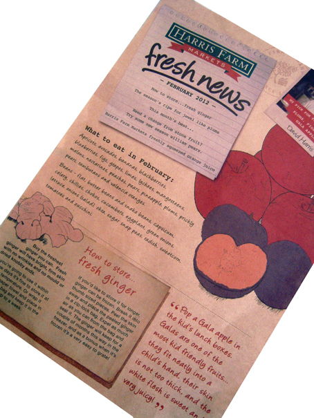
This flyer was stuffed into my shopping bag at the check-out recently. You can’t get much more direct than that – marketing collateral from the actual person who is taking my money. What next? The owner of the shop comes round and gives me a hand-written note?
Actually, that is indeed the effect this piece aims to generate with all its elements of artfully-designed low-tech ‘manual’ communication – the pen-and-wash drawings, the Polaroid-style photo (interesting how the Polaroid is a marker of authenticity), the personal signature, the quotes (as if being spoken to by somebody), the script-like fonts.
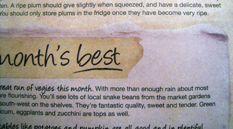
I counted five elements that reproduce the effect of somebody writing on a piece of paper – in effect, five bits of paper stuck onto this one sheet, including one note on the reverse which looks as if it was written on masking tape and then attached to another note. So that’s a note on top of a note on top of the brown paper flyer. Another reversed-out type style mimics the effect of an instant label maker.

The whole piece is just begging to be clipped to a noticeboard or stuck on the fridge – which, of course, is the dream outcome for any direct marketing item: to be kept, to be valued, to offer on-going and continuing utility to the consumer beyond the immediate transaction – as every marketer must strive to achieve.
A quick word about the paper. Brown.
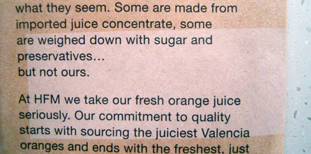
Natural, earthy, maybe even home-made/grown and organic as befitting a vegetable shop, unpretentious like the kraft paper used to make shopping bags. This sheet fairly crackles like a stiff carrier bag. And yet it is not uniformly brown; there is a lighter patch on the reverse which looks as if it has been bleached lighter, not over-printed. Is it a manufacturing defect? I don’t get it at all. Of all the elements on this sheet – and I haven’t even mentioned the actual content which is quite dense – it is this little pale patch which continues to mystify me.

* Yes, that’s right, this is not a ‘greengrocers’ apostrophe’.


