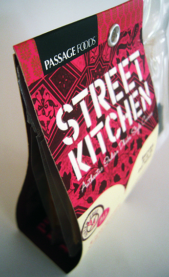
This is an example of the current trend in post-modern packaging whereby the carton isn’t really a carton at all – look, no sides, no lid– but just a beefed-up label which has been pressed into service to act as a package.
Basically it’s just a strip of cardboard with a couple of folds and a rivet to hold it together. Not much more than a swing-tag label really. Very deconstructed.
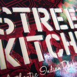
It does feature a combination of matt and gloss varnishes, however, and the main Street Kitchen lettering is actually embossed to give it a tactile Braille-like effect (as also used on this curry sauce packet – maybe that’s another trend). So even though the packaging itself is fairly low-tech as a piece of engineering, the finish is more involved than might be expected of a curry sauce packet.
Boundaries are being blurred, age-old differences between packaging and labels are crumbling, so that what we have today is the cross-over package/label, neither one thing nor t’other but rather both.


