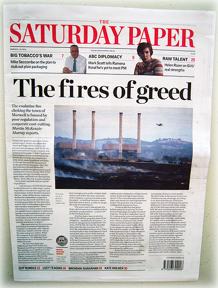
It’s Saturday. And it’s a newspaper. This is from the same people who brought us The Monthly magazine and Quarterly Essay, thus continuing a resolutely literal-minded tradition of naming of publications according to what they are and when they come out.
As a long-time reader and subscriber to The Monthly, I had been looking forward to arrival of The Saturday Paper but, as noted elsewhere, I too was somewhat under-whelmed by its initial incarnation.
I’ve always admired The Monthly for being text-heavy and using photographs sparingly, sometimes obliquely but always effectively. Transferring that style over to a newspaper, however, is not easy. A lot of the photos in this issue were of mediocre quality and there were too few of them (which reminds me of that joke in Annie Hall). Having fewer pics might work well in a monthly publication when there is time to research good quality ones but a newspaper needs more than that. It’s not a magazine.
The nadir for me was a profile about an entertainer or celebrity which made several references to his changed appearance but included not a single portrait pic. I still have no idea what he looks like.
We’ve had full-colour printing in newspapers for nearly 20 years now – not in every paper but most – so it seems rather perverse when a paper reverts to black and white imagery (even if it’s not a true mono) for no good reason or has no photos at all. The irony is that The Saturday Paper is printed on higher quality, more expensive stock than just about every other newspaper and yet the ones battling along on plain old 42gsm recycled stock still come up looking brighter, more colourful and easier to read, regardless of content.


