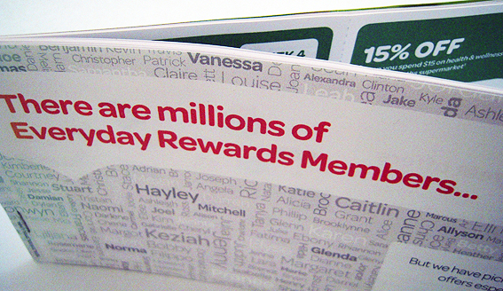
This is the counterpart to the Coles flyer that I gushed about so embarrassingly a couple of years ago.
The main difference between the Coles and Woolies offerings is that whereas the former was a single folded sheet, this one comprises DL-size pages stapled together as a booklet. Also the Coles one was printed by a high-speed inkjet machine whereas this one looks more toner-based which, to my eyes at least, smacks a little bit of ‘Let’s just use the office photocopier…’.
The other noticeable difference is that Woolies make more of the fact that the coupons are personalised and in fact draw attention to the manner in which the offers are personalised via use of the customer’s name.
So, for example, the cover is made up of many different names which then serves to highlight the insertion of the recipient’s name printed in the same font and colour as the main head. The name is then reproduced on each coupon.
But, as in real-life interactions, to what extent does the frequent use of a person’s first name make it seem more personal or just a little creepy?
Print personalisation is a complex process and its effectiveness is usually dependent on the quality of the data held about the customer and their buying habits. Sometimes it is done well, sometimes it doesn’t matter if it is wrong, and then there are those cringeworthy attempts which are best forgotten about.
If you are going to highlight the process of personalisation, i.e. by putting it on the front cover, simply bunging in someone’s name every so often isn’t going to impress. Instead of making the recipient feel valued and appreciated, it actually comes across as more impersonal. ‘These exclusive offers especially for you [INSERT NAME]’ is merely a reminder that, as far as big corporations are concerned, your existence amounts to little more than bits and bytes in a distant mainframe.


